Yuanbo Wang
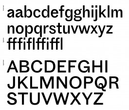
Breite Grotesk YB
Source material: Breite Grotesk (Bauer, before 1909)
Spring semester 2020
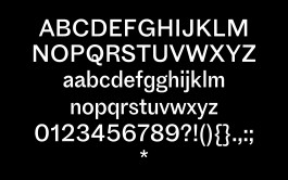
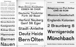
“Breite Grotesk YB” is based on “Breite Grotesk” — an early range of sans serifs from the 1850s, released by Bauer Type Foundry around 1909, and it disappears after 1915 or so, to be replaced by more polished designs. To contemporary eyes, these letters have clearly different shapes and details in different sizes.
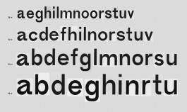
I was fascinated by the weird “a” in 40pt — the big squoosh stomach and narrow counter; also “u” and “n” in 28pt — the strong contract between the flat and curved strokes. I want to resolve these best details from the original into a more contemporary Grotesk: systematic, useful, yet also joyful.
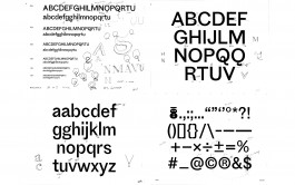
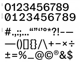
I started with lowercase letters based on 28 pt, which has a tight rhythm. For the uppercase, to keep a bit of old-fashioned taste, I add the weight and spacing. Due to the lack of the original resource, I drew all the punctuations and tabular numbers matching the system. So far, I was trying to make this typeface to be easier to read as body-text as well as display.
