Furqan Jawed
Ronaldson FJ
Source material: Ronaldson (McKellar, Smiths & Jordan/ATF, 1884)
Spring semester 2020

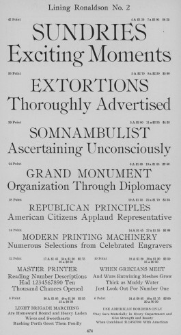
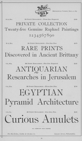
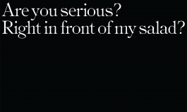
I was drawn to the sharp aggressive serifs of this typeface that managed to make it look sophisticated and sensual, especially the anchor hooks in ‘T’, ‘E’, ‘G’ etc
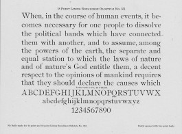

The width of the sharp wide serifs were reduced to optimise spacing between the letters.
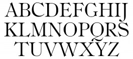
The weight I’ve drawn (18 points) is ideal for attention-grabbing headlines.

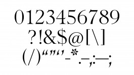
The numbers, punctuation and special characters were altered from the scan to bring in the typical characters like the dagger shaped serifs as seen in the letters.
