Saerom Kim
PROJECT TITLE
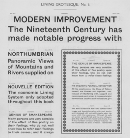
Source material: Grotesque No. 6 (Stephenson Blake & Co., 1927)
2743 Introduction to Typeface Design, Fall 2025
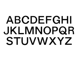
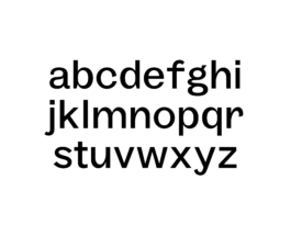
SB Grotesque No. 6 Text is a revival of Stephenson Blake’s early grotesque Grotesque No. 6, reworked for body-text use.
While early grotesques are compelling for their rough proportions and traces of serif construction, they often feel uneven and overly expressive in extended reading. SB Grotesque No. 6 strongly embodies the defining qualities of early grotesques, with assertive proportions, uneven rhythms, and constructional quirks that give the typeface a distinct and expressive identity. This project softens and reorganizes those features to improve readability at text sizes, while preserving the original’s distinctive character. Intended primarily for 10–12 point body text, the typeface also retains enough personality to function in display contexts.
These student typeface designs created at Yale School of Art are noncommercial academic projects, commonly revivals or reinterpretations of historical typefaces. Read more about these typeface design courses at Yale School of Art.
© 2020–2026 Yale School of Art. All rights reserved.