Hasti Kasraei
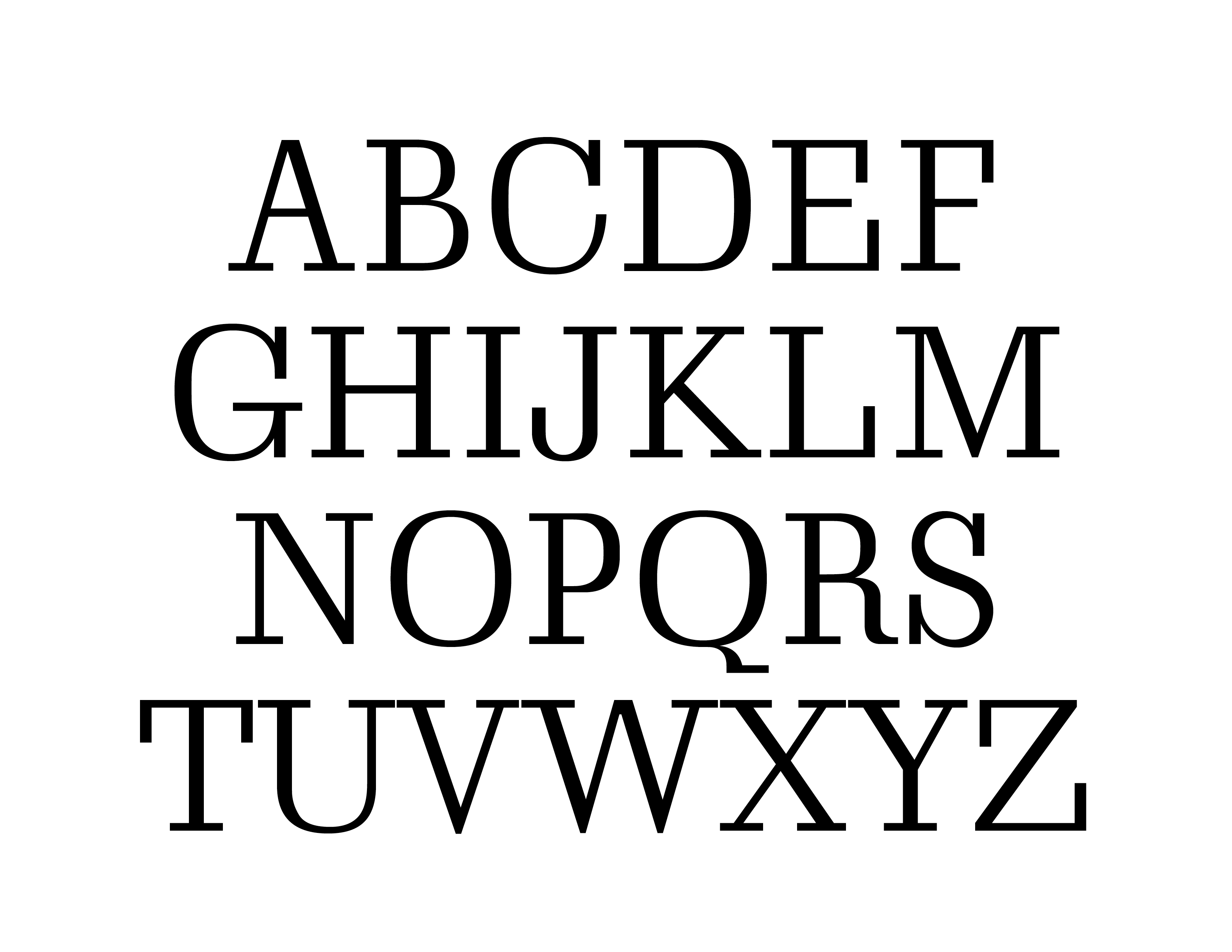
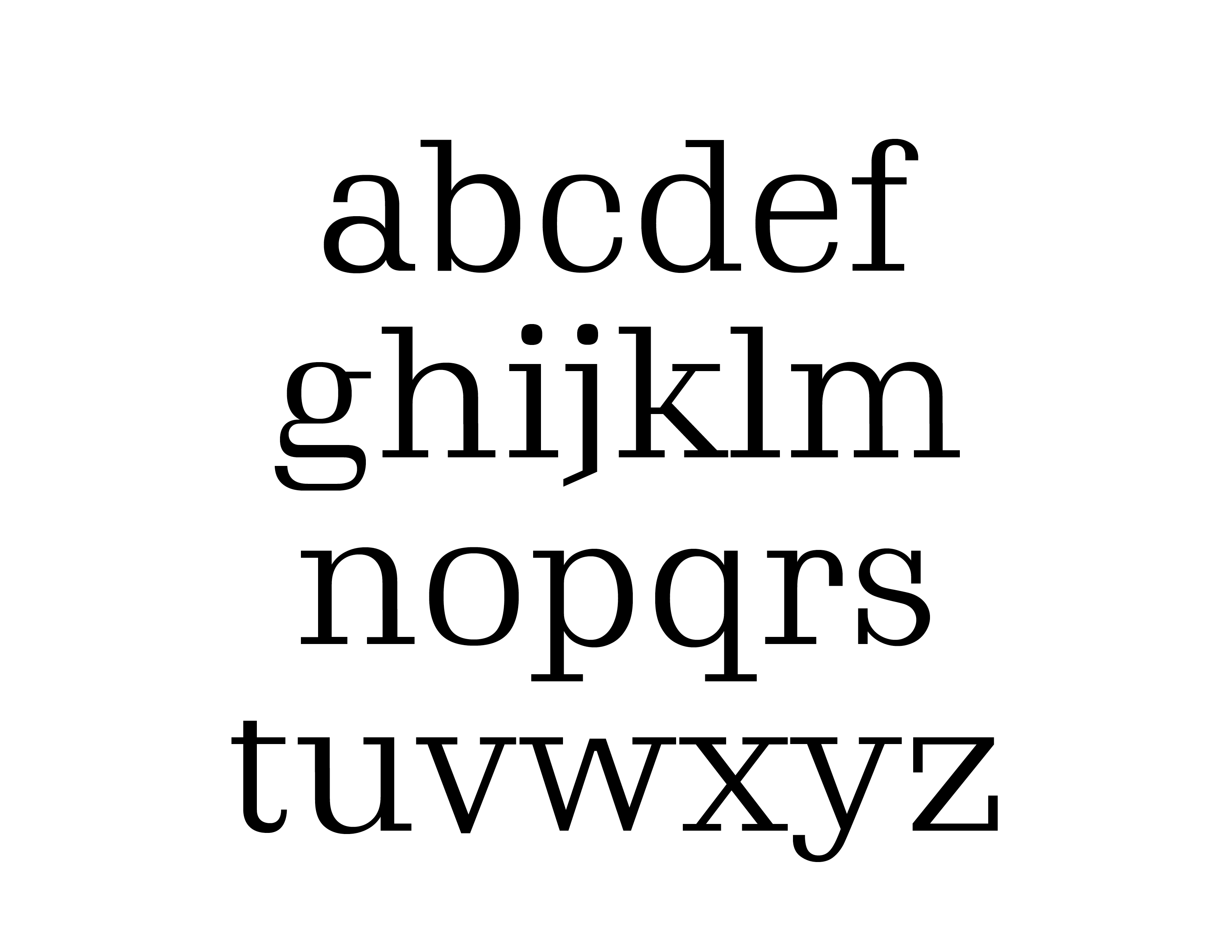
METANOÍA
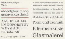
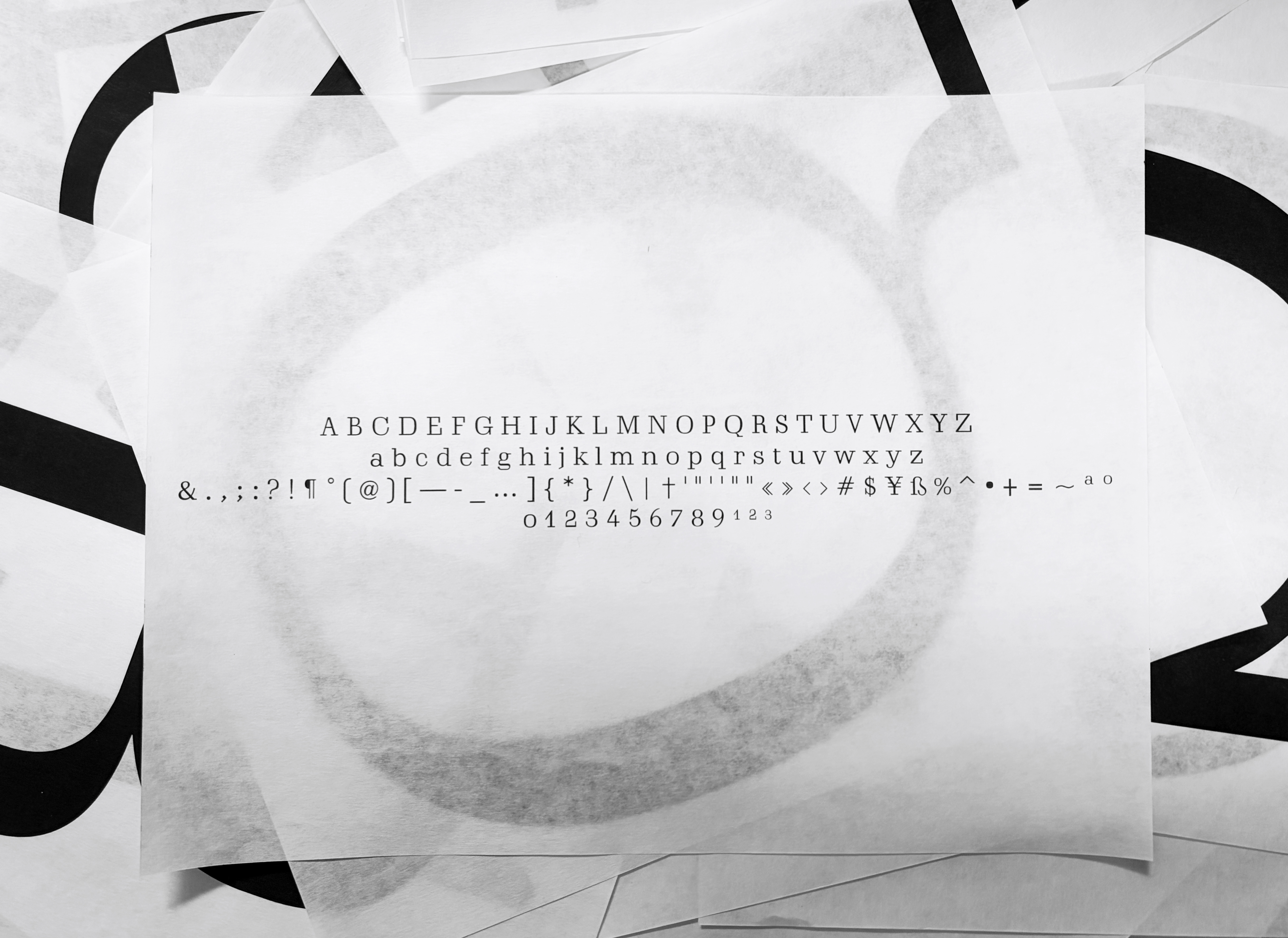
Source material: Schadow (H. Berthold, 1938)
2743 Introduction to Typeface Design, Fall 2025
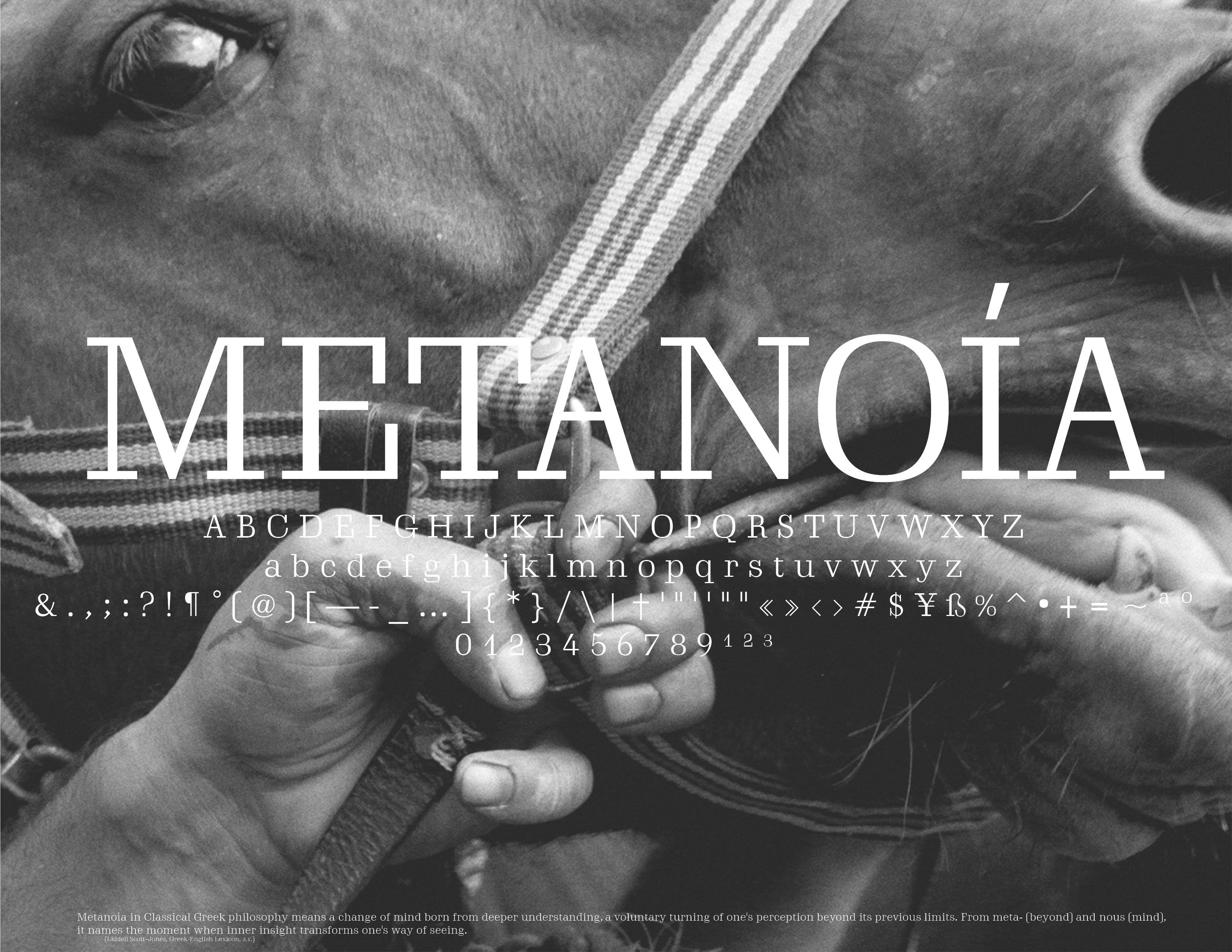
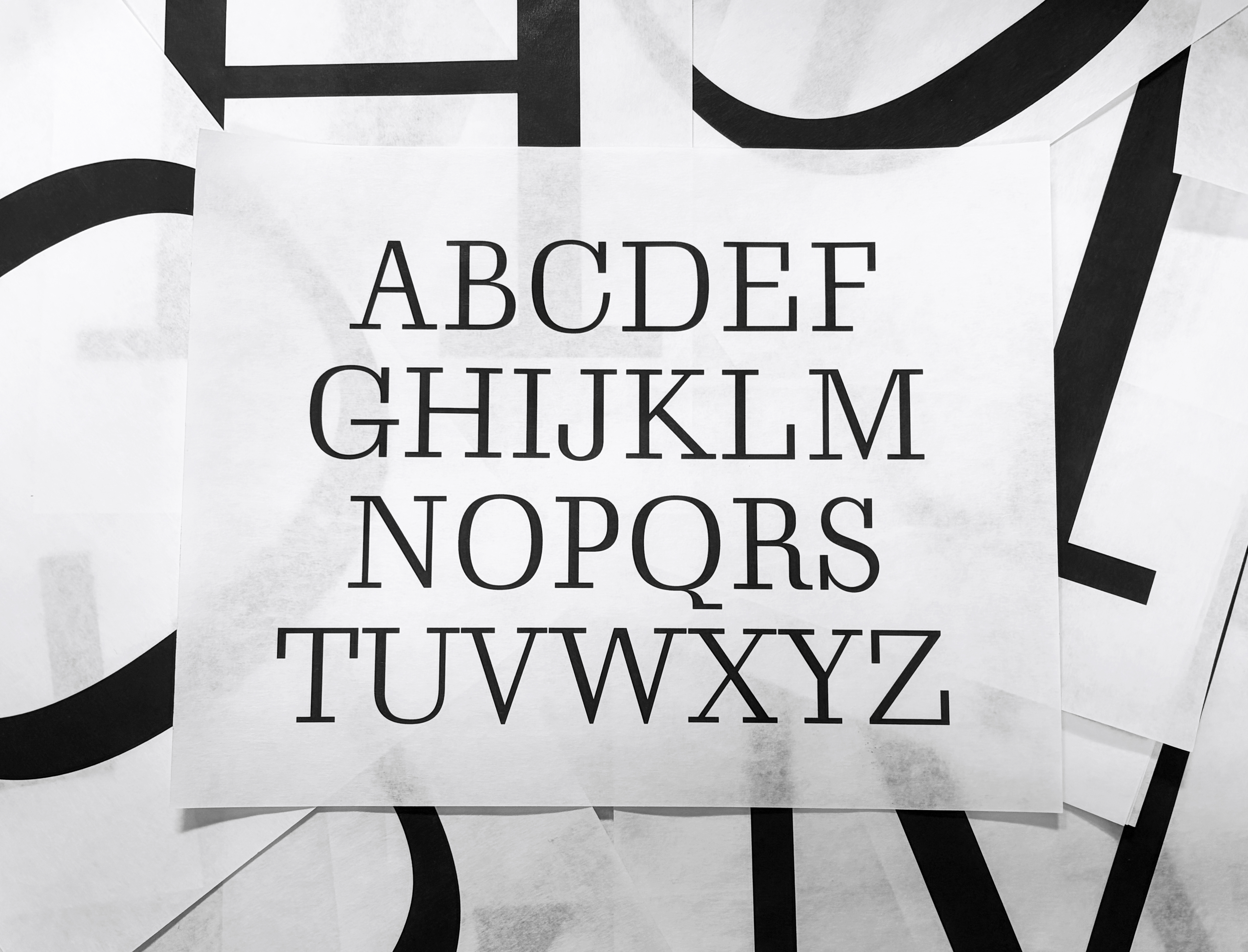
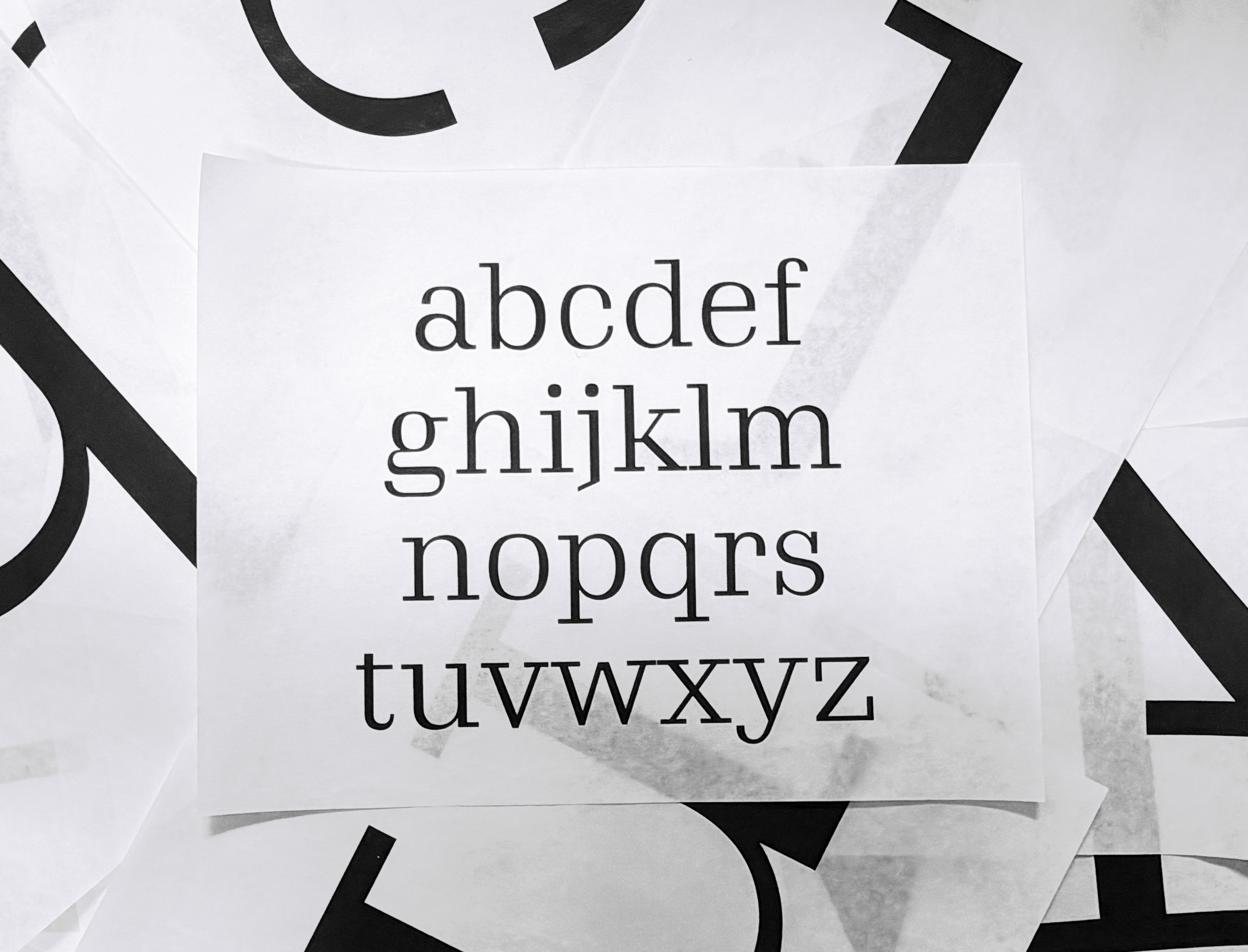
This project started with my search for a slab serif for body text, where contrast was a main criterion for creating rhythm on the page and an enjoyable reading experience. I thought a lot about how structure and modulation can make reading feel calm, tactile, and continuous. At the same time, the process turned into a practice of discipline and focus, a way of choosing structure rather than resisting it. I chose Schadow because it is rigorously built, yet still allows moments of openness within its system. That tension between control and release sits at the center of this project, both typographically and conceptually.
These student typeface designs created at Yale School of Art are noncommercial academic projects, commonly revivals or reinterpretations of historical typefaces. Read more about these typeface design courses at Yale School of Art.
© 2020–2026 Yale School of Art. All rights reserved.