Manni Su
Palatino Scribes
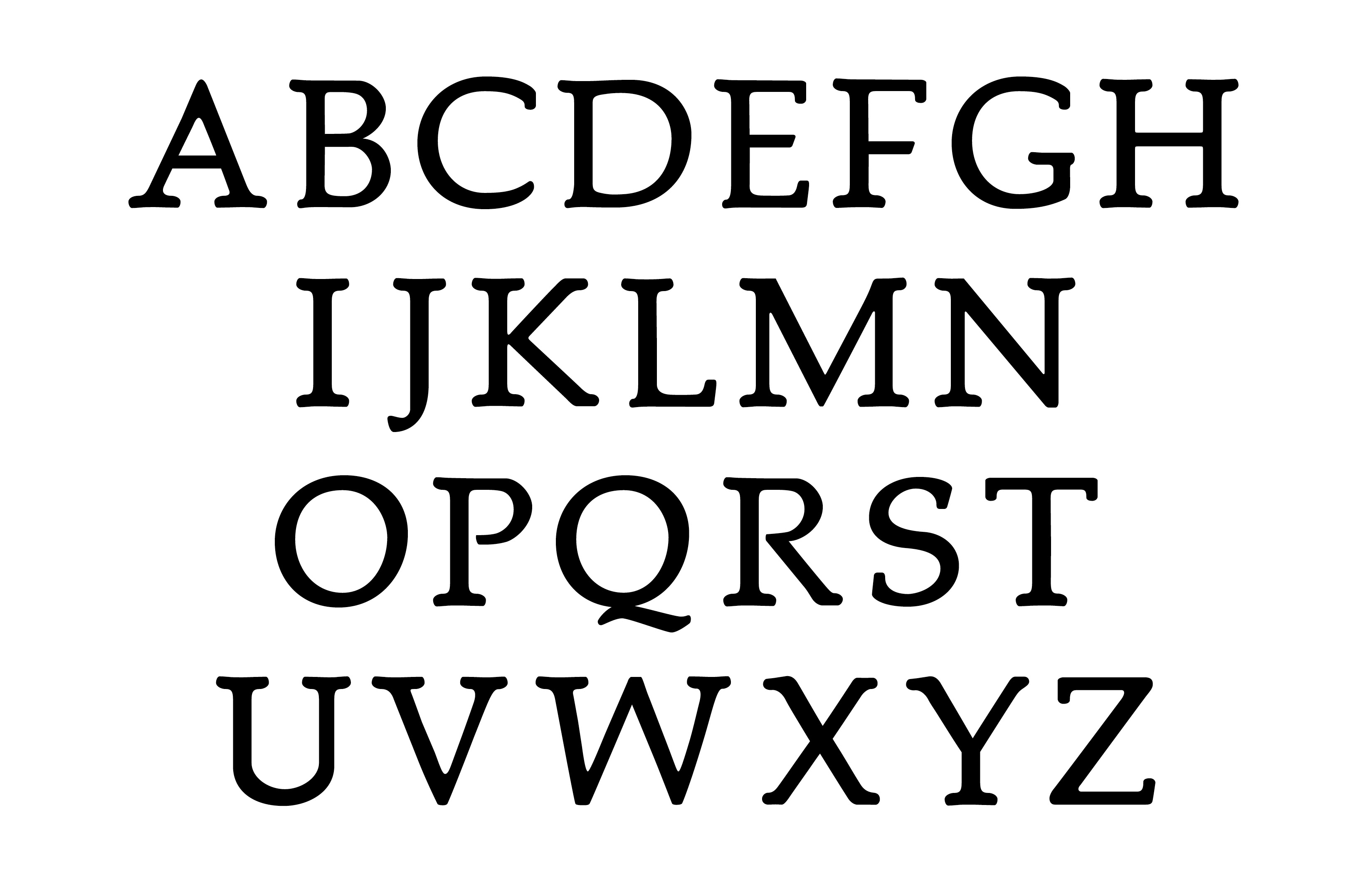
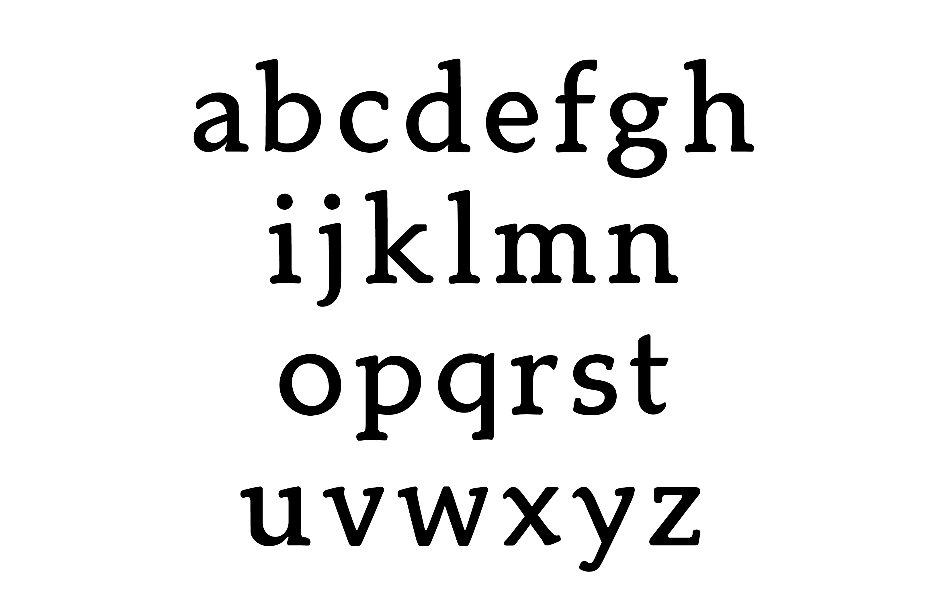
Source material: Palatino (Stempel, 10pt)
2743 Introduction to Typeface Design, Fall 2025
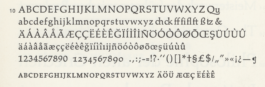
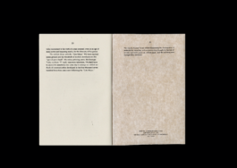
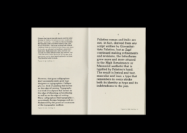
In a second-hand bookstore, I was drawn to a book published by Suhrkamp. Its body text was set in a small-sized Palatino. And based on that, I softened the contrast and made the strokes smoother, attempting to recreate the ink-soaked texture of printing.

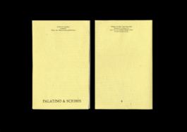
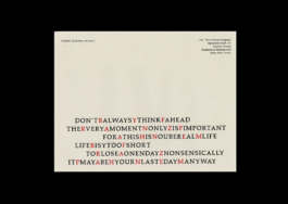
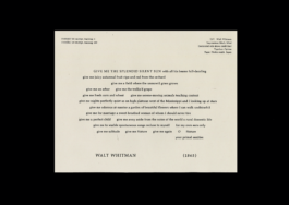
Orbis Typographicus (“The Typographic World”)
is a set of twenty-nine 9 × 12 letterpress broadsides, designed by Hermann Zapf and printed by Philip Metzger of Crabgrass Press between 1970 and 1980. The text includes poetry, prose, anagrams, and palindromes, in English, German, French, and Japanese. Typeset by hand by Philip Metzger, the set pays tribute to worthy “Thoughts, words and phrases on the Arts and Sciences” through Zapf’s unconventional and ingenious use of typography. Orbis Typographicus functions both as a work of literary wall art and as an elaborate type specimen, showcasing many of Zapf’s own typefaces.
I was really fascinated by this story, so I imitated the original layout and re-designed several pieces using my revived Palatino.
These student typeface designs created at Yale School of Art are noncommercial academic projects, commonly revivals or reinterpretations of historical typefaces. Read more about these typeface design courses at Yale School of Art.
© 2020–2026 Yale School of Art. All rights reserved.