Bianca Ibarlucea
Feral
Source material:
Caracteres Fantasques-Larges
(Deberny & Cie)
Fall semester 2020
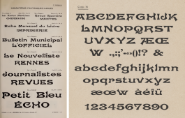
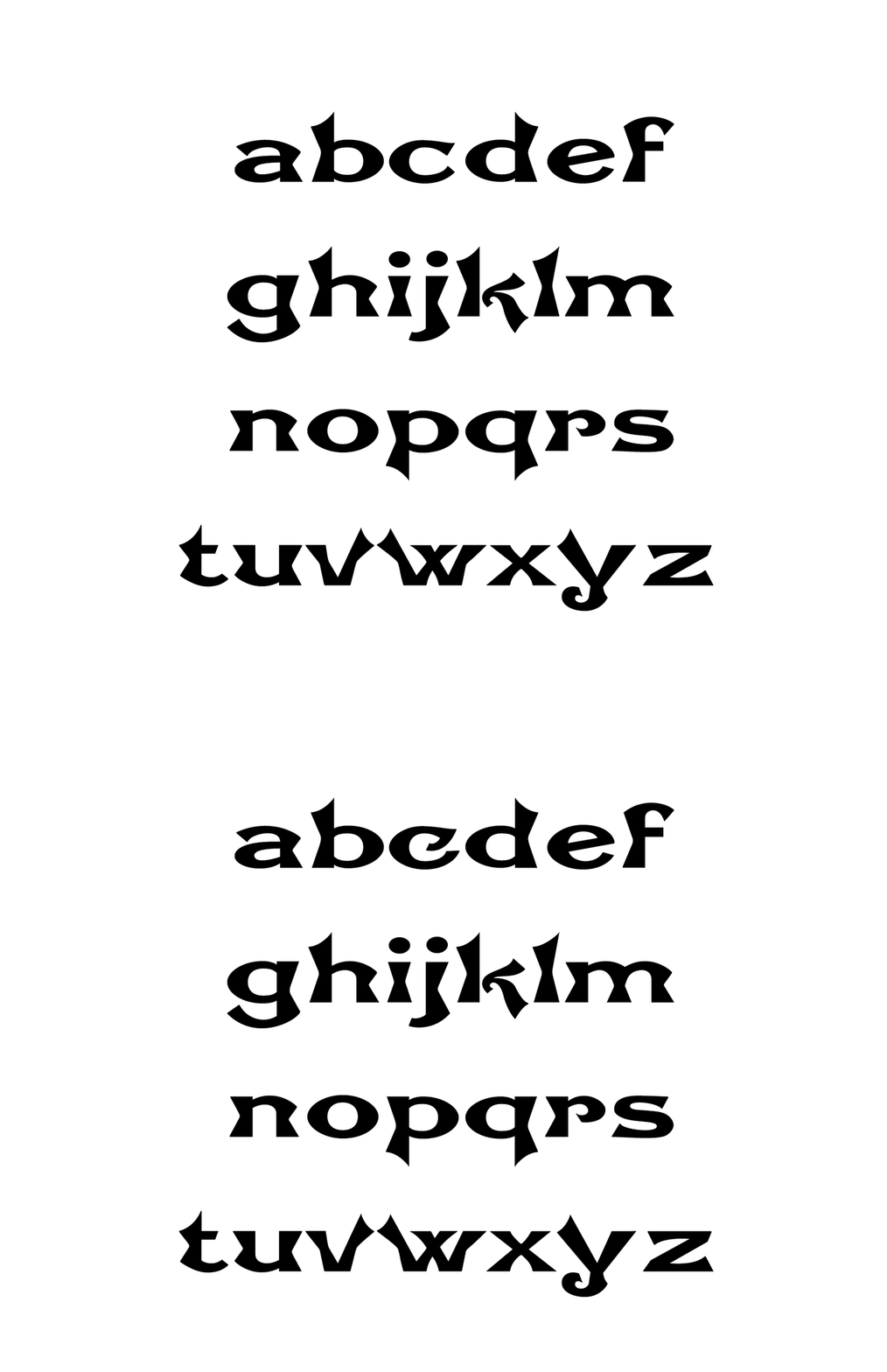
What initially drew me to these letters was the eccentricity brought about by the dips in the stems, as well as the wide body widths. However, when I began to look closely at the forms, I noticed the dips were inconsistent throughout the specimen, some “dipped” sharply, and some were more smooth, and I noticed the original designer varied the type of “dip” depending on the letter, like in lowercase i, l, h, n, and m, they each required a different type of dip depending on the height of the stem.
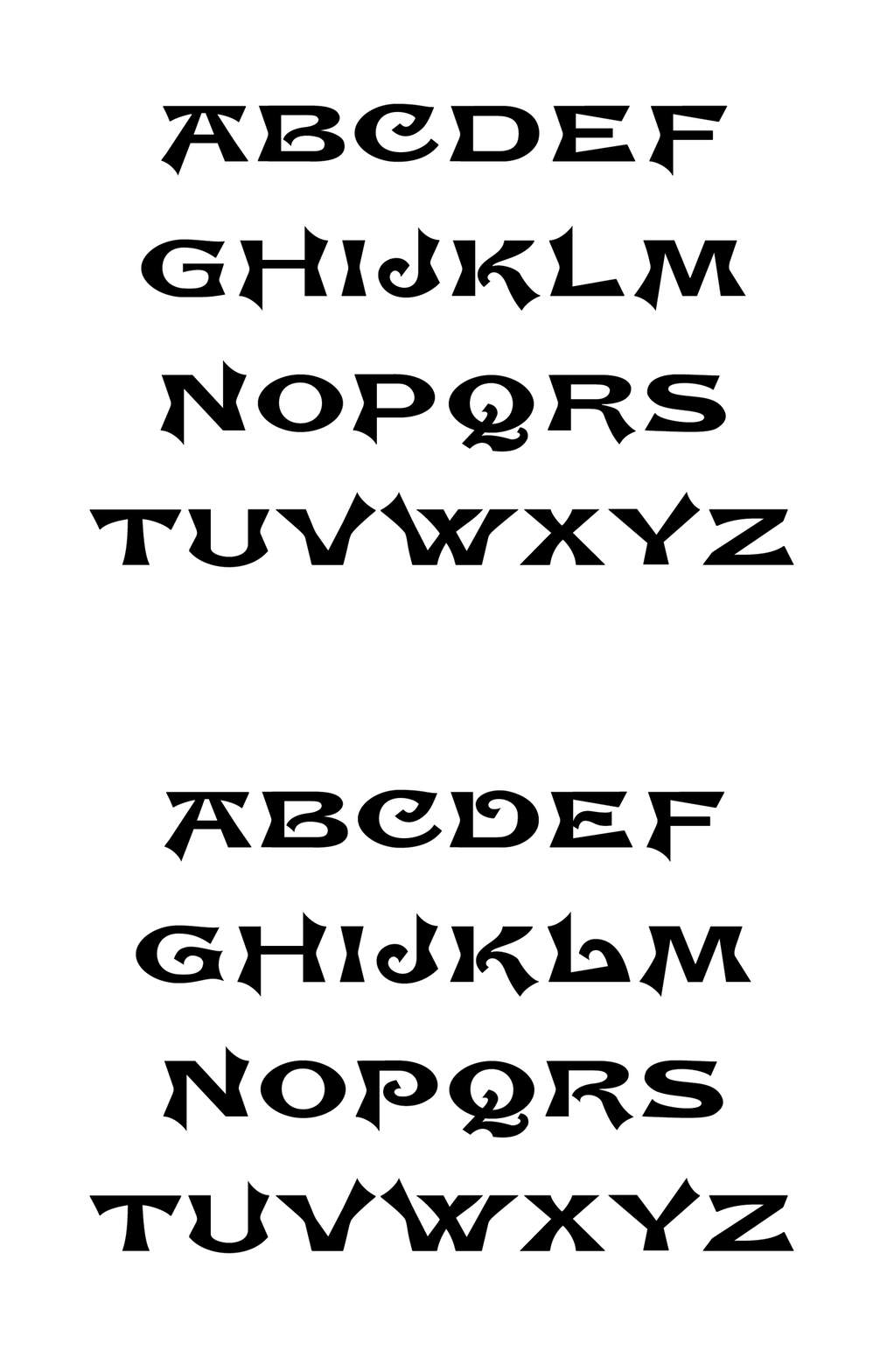
I wasn’t crazy about the swirl and twirl effects in most of the letters, so I made new versions of a few, and in these new forms the bowls join and are fused to the stem bringing some stability to the whole set. The cap A, and H, were replaced by their alternates which have a straight crossbar instead of one that dips, the originals aren’t available in the font.
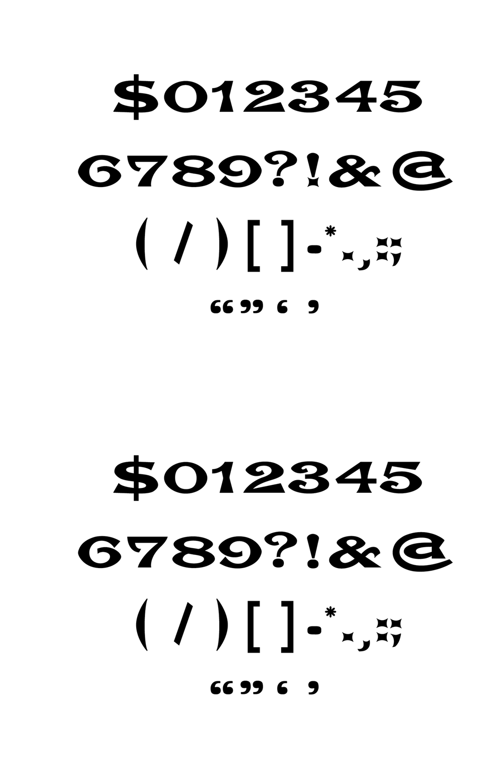
In the original specimen, the punctuation marks are missing some of the extravagancies from the rest of the typeface, they don’t seem to fit, so I made new versions which reflect the dips and curves in the rest of the forms.
