David Jon Walker
VG-Travelogue
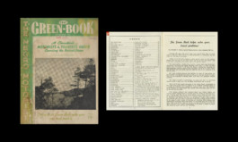
Source material: The Green Book (A Vintage Travel Publication)/Ludlow Radiant/Stempel Omega
Fall Semester 2021

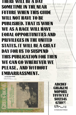
VG Travelogue is a typeface based on a hand-drawn masthead from the 1946-47 editions of Victor Green’s Green Book. The Green Book was a classifieds based travel guide for African-Americans in the United States to provide safe routes for traversing the socially dangerous roads across a nation and advertising welcoming establishments for vacations, overnight stays, or short stops for dining or restroom breaks. The titling typeface is meant to represent the strength and persistence of Black life through travel and experience. The personality of the letterforms and the contrasting weight serves as a nuanced testament to varied life experiences of a people during that timespan.

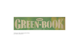
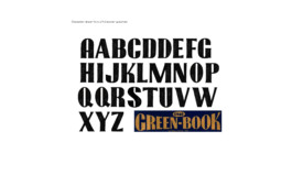
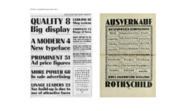



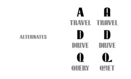
Because the masthead was illustrated, the characters featured individual highlights that were hard to translate into a formal system. While attempting to remain true to the display font, I amplified certain features in order create harmony and rhythm between the letterforms. With such high contrast, the color and counterforms needed to dance with impeccable synchronization.
