Avery Youngblood
Eating Juices!
Source material: Old Style Condensed No2 (Barnhart Brothers & Spindler Type Foundry, 1896)
Spring semester 2022
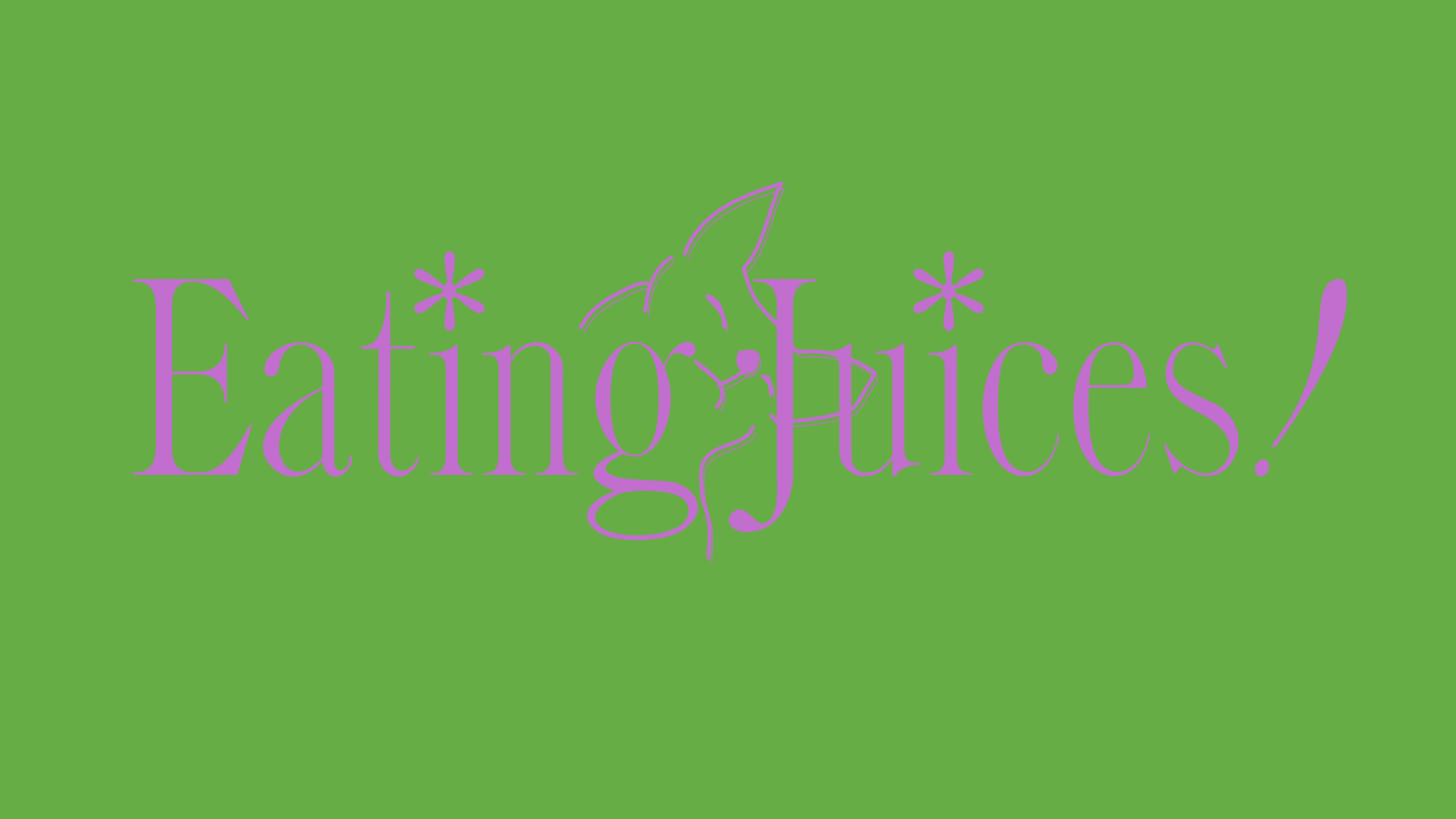
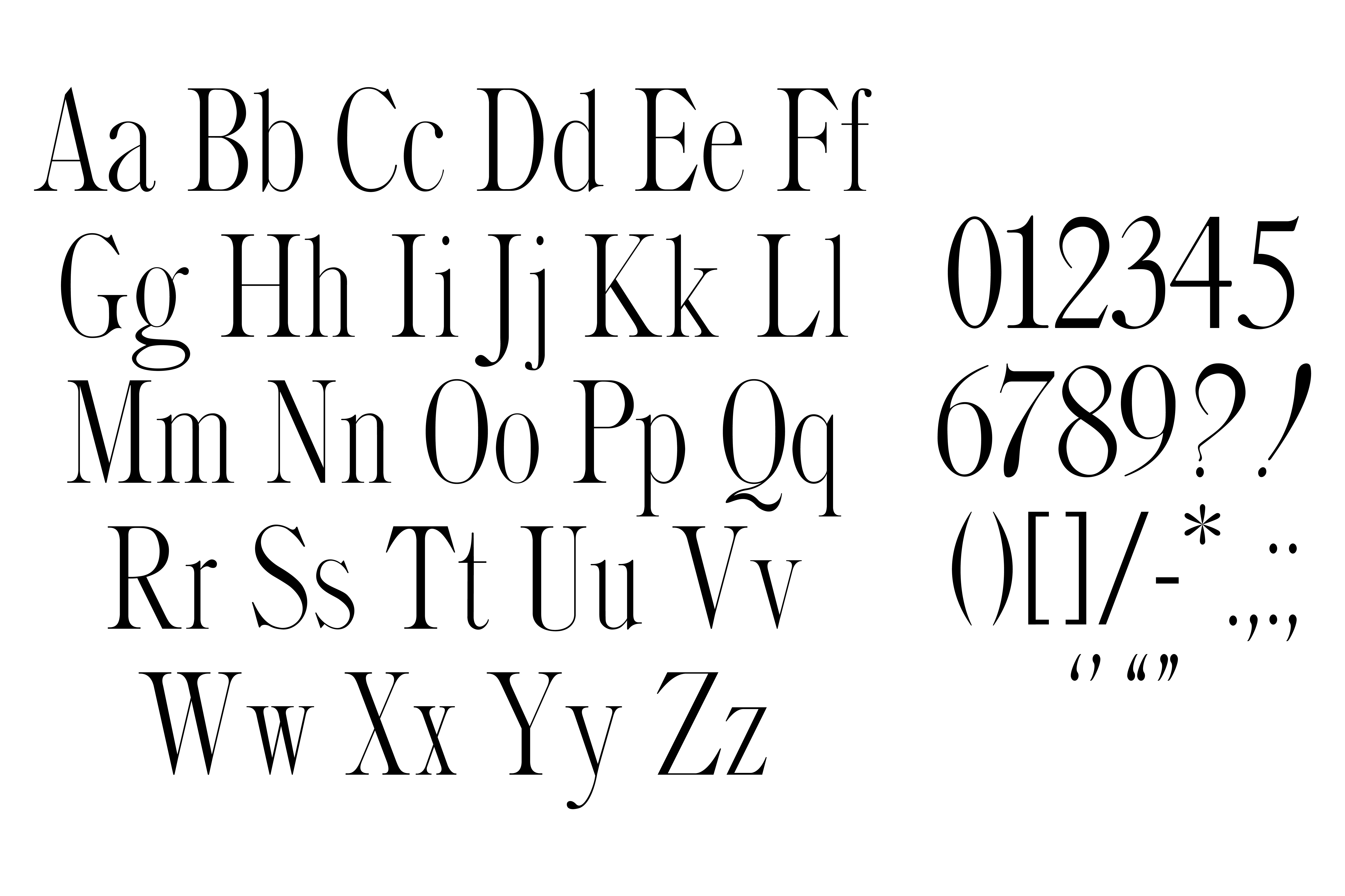
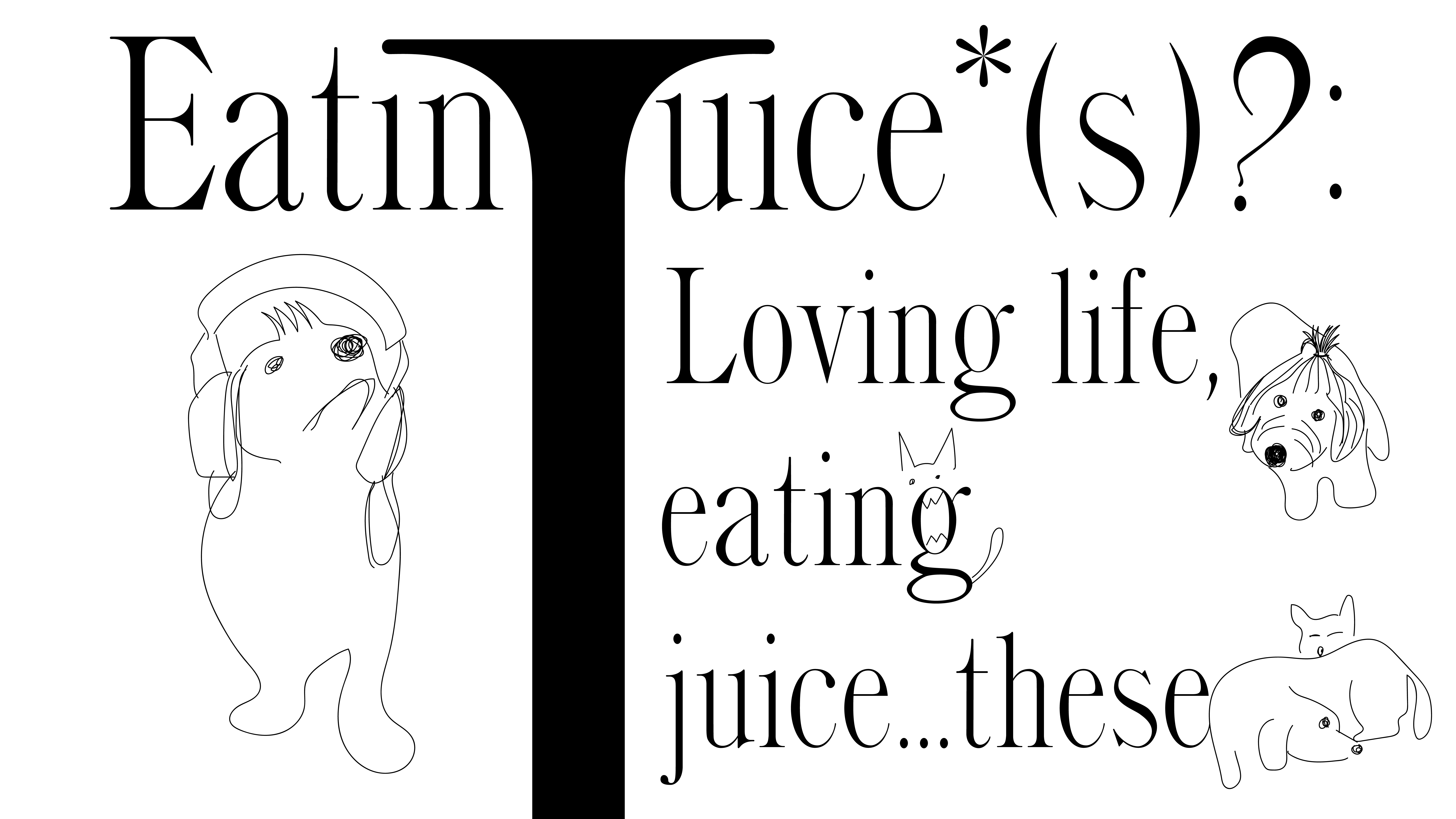
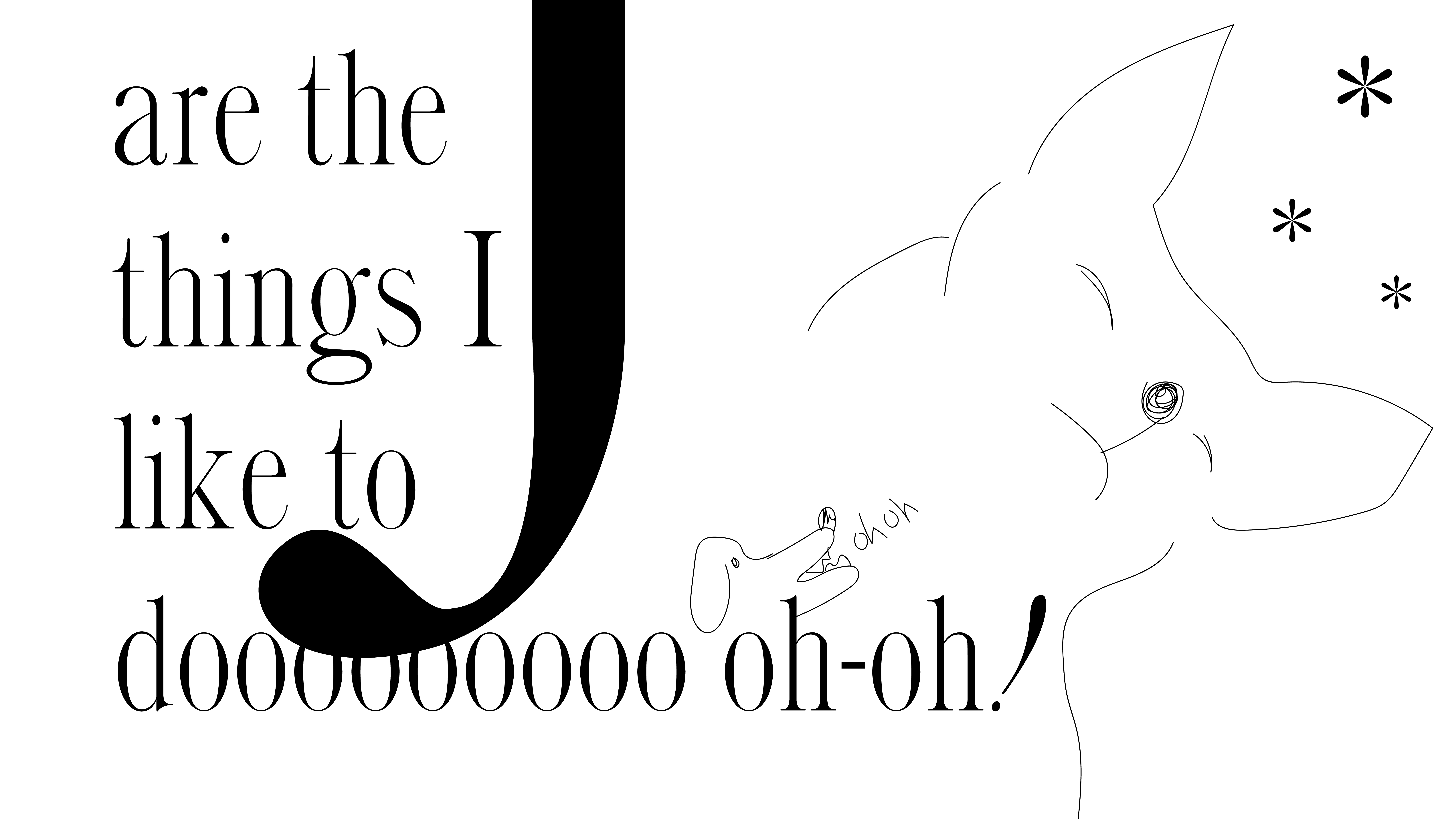
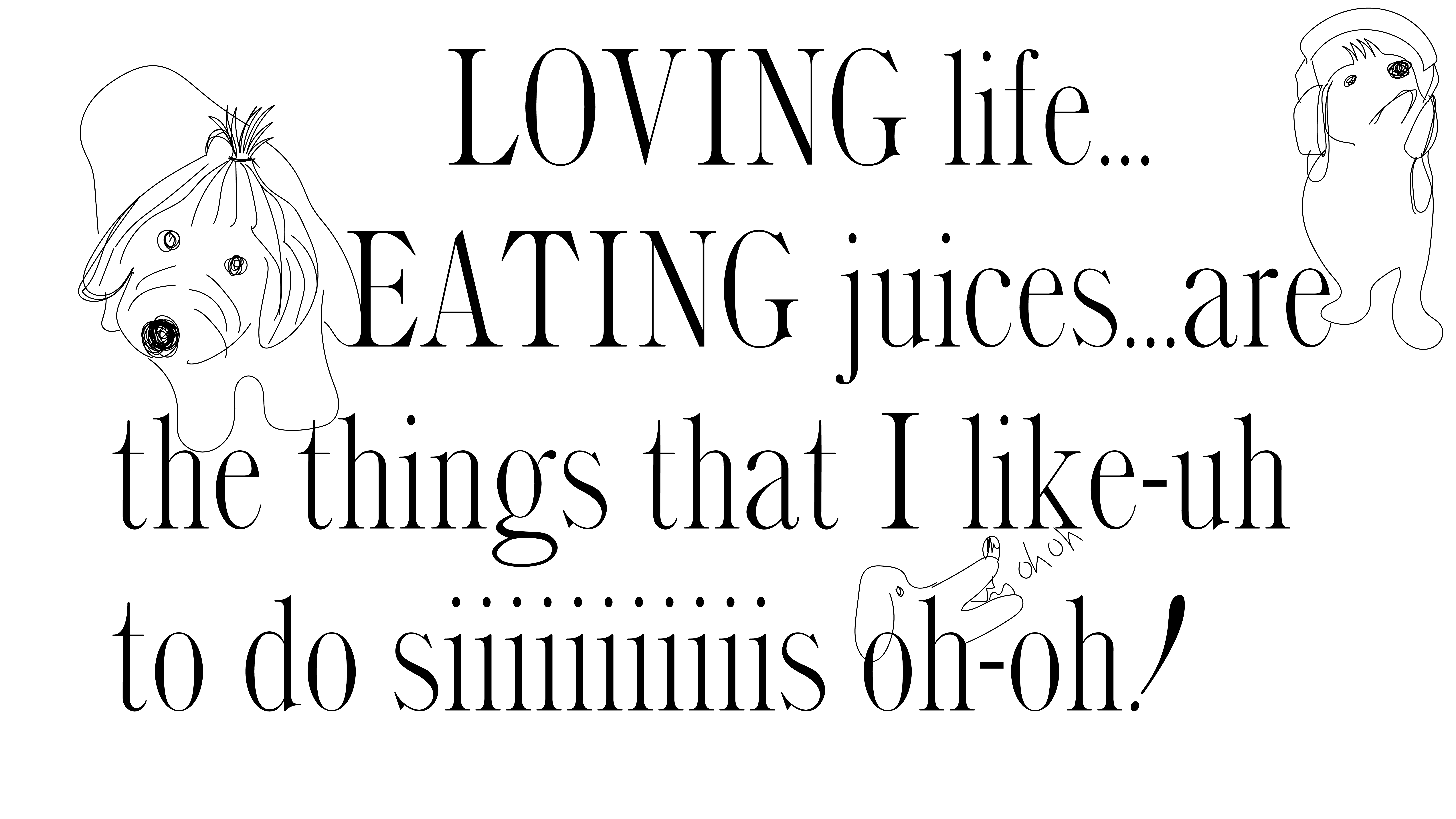
Eating Juices! is a graceful and sharp display typeface, yet it has its whimsical and exaggerated, dare I say dramatic moments. This typeface initially stood out to me because of its high-contrast of thin and thick stems, its high-contrast of sharp and globule terminals. I named this typeface Eating Juices! because the dilemma that this name presents is one of similar proportions to working with this typeface. You eat solid foods, you drink liquids, so how can one eat juices? This typeface was a similar conundrum in that its contrast with each letter was so apparent, I wasn't sure how it was going to work together, how will I space these letters for the eye to consume as a solid juicy meal? But, I embraced the challenge, and with a few quirky additions of my own, now I have a typeface where there are juicy parts to drink and there are solid parts to eat!
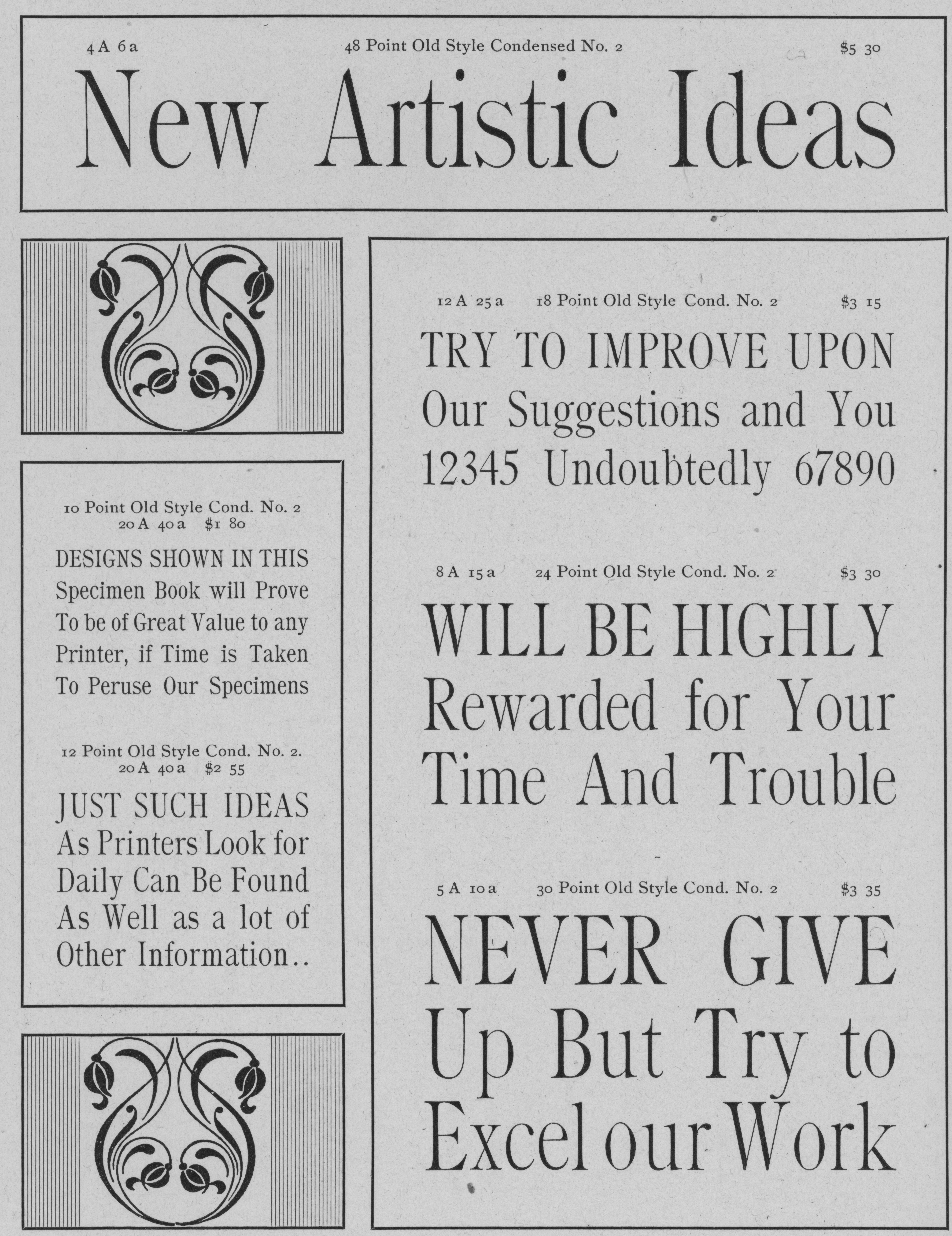
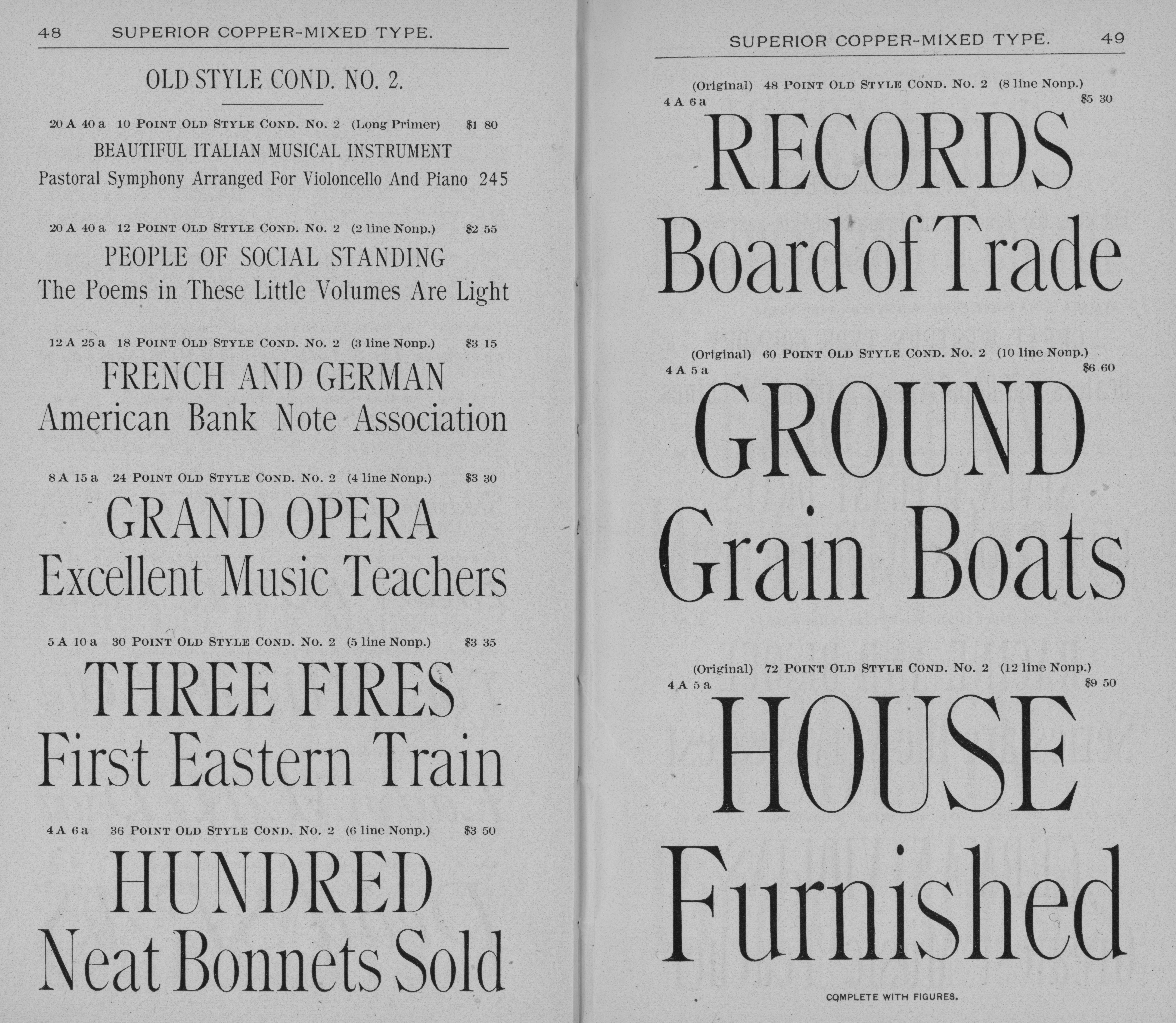
The type specimen I originally worked from is Old Style Condensed No2 designed in 1896 by Barnhart Brothers & Spindler Type Foundry. This type foundry was founded as the Great Western Type Foundry in 1873. It became Barnhart Brothers & Spindler ten years later. It was a successful foundry known for innovative type design and well designed type catalogs. It was bought out by American Type Founders in 1911, and the foundry was finally closed in 1933.
