Filip Birkner
3200dpi_uncoated
Source material: 3200dpi_uncoated (Dual Gothic)
Spring semester 2023
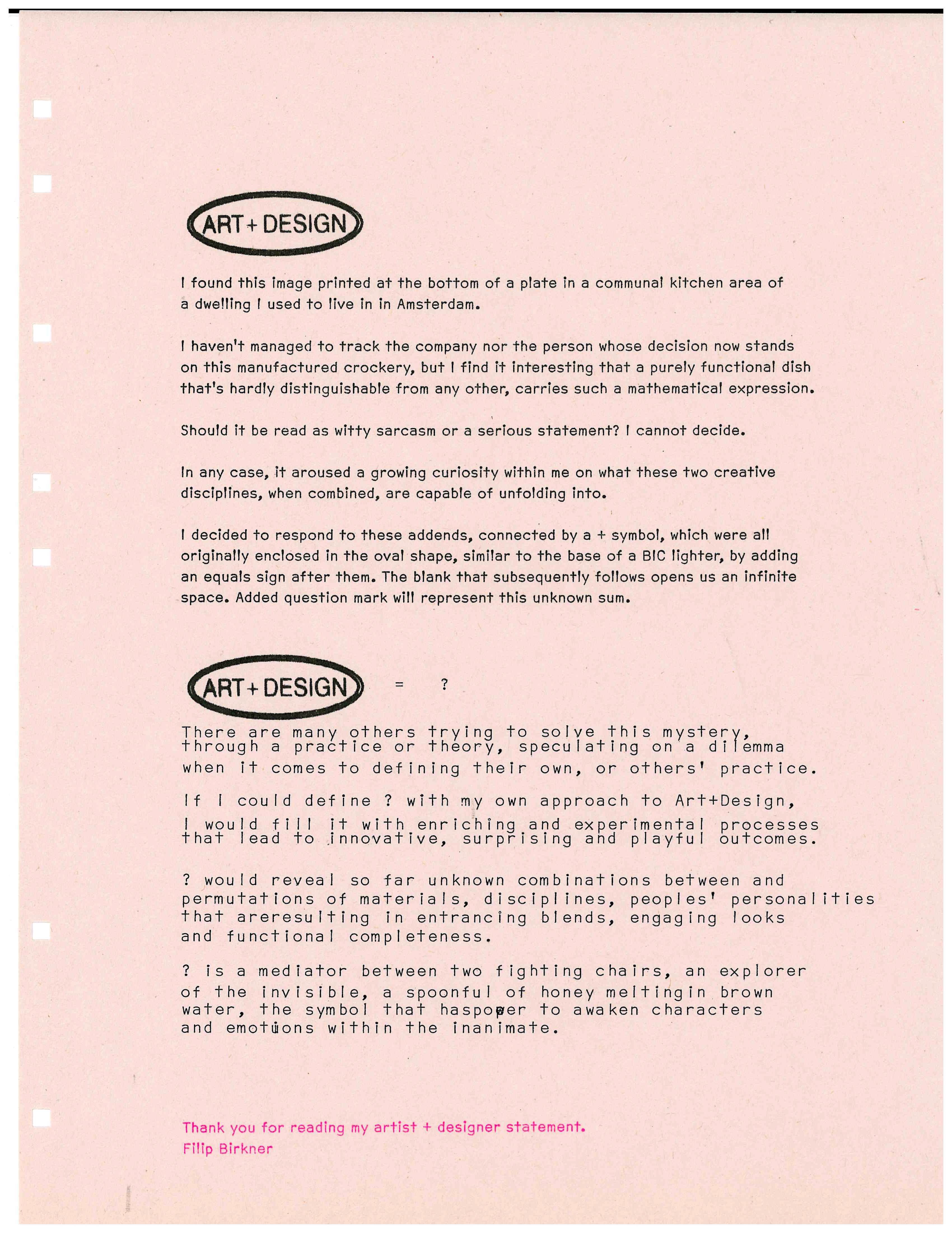
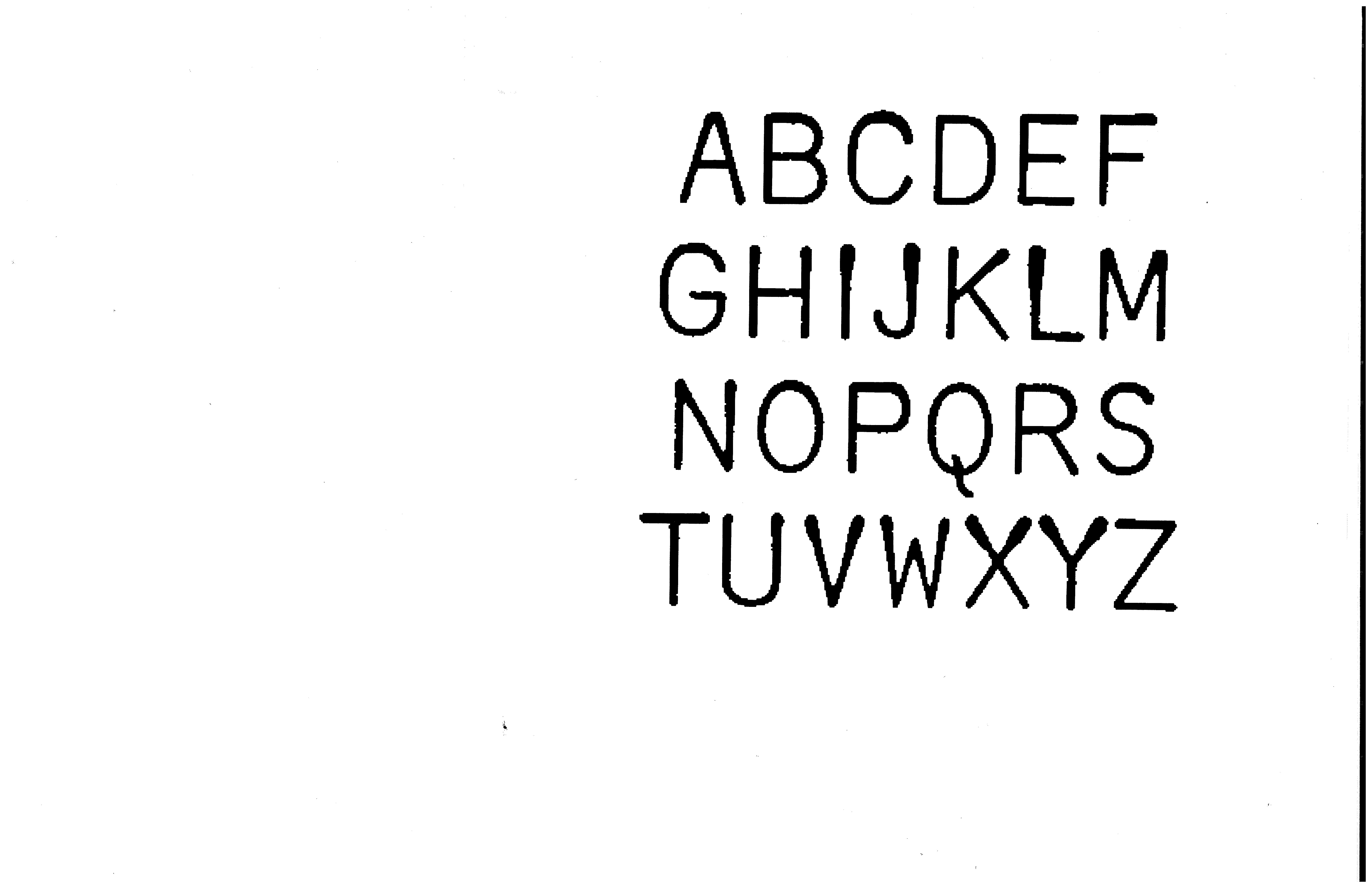

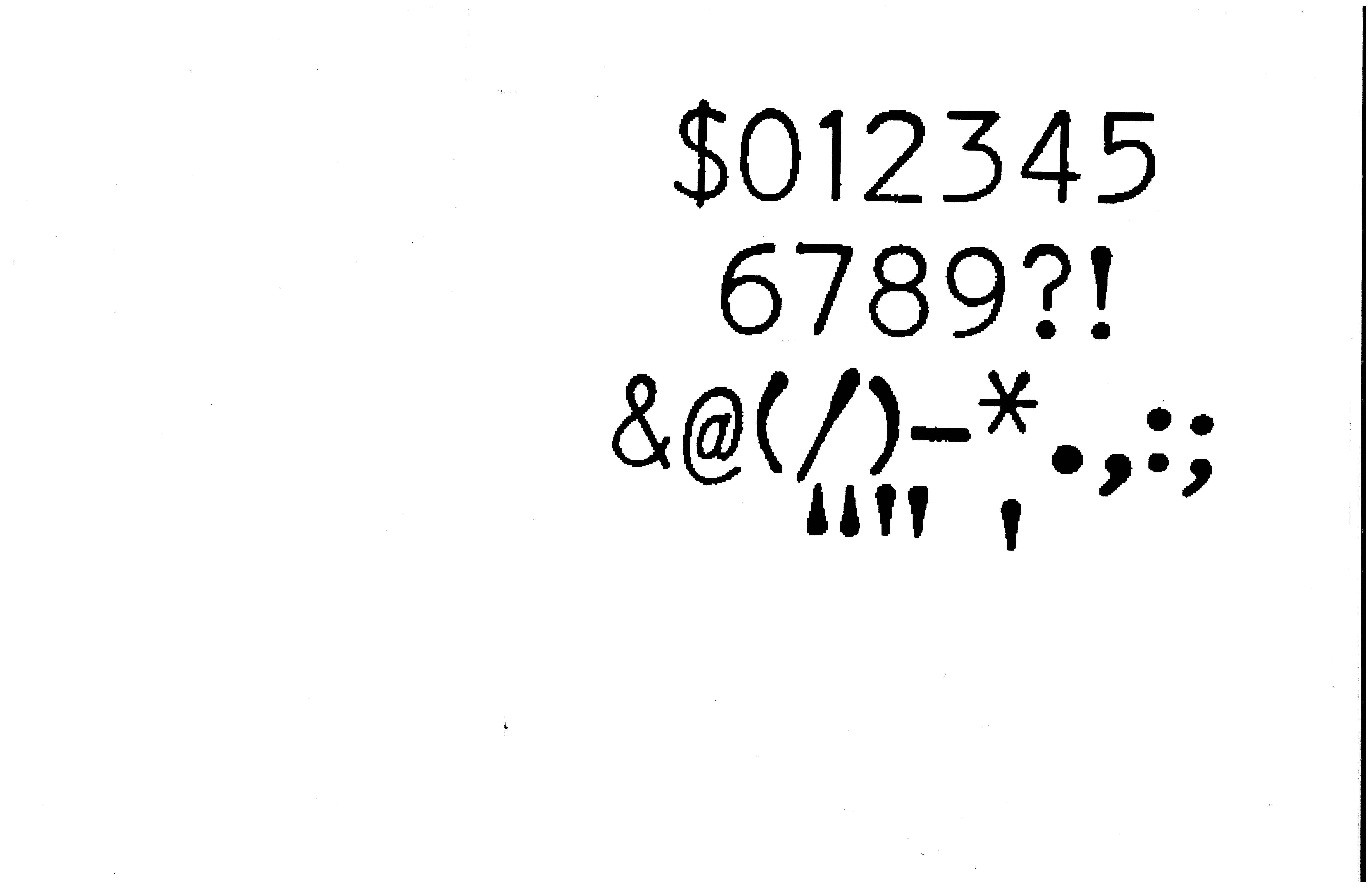
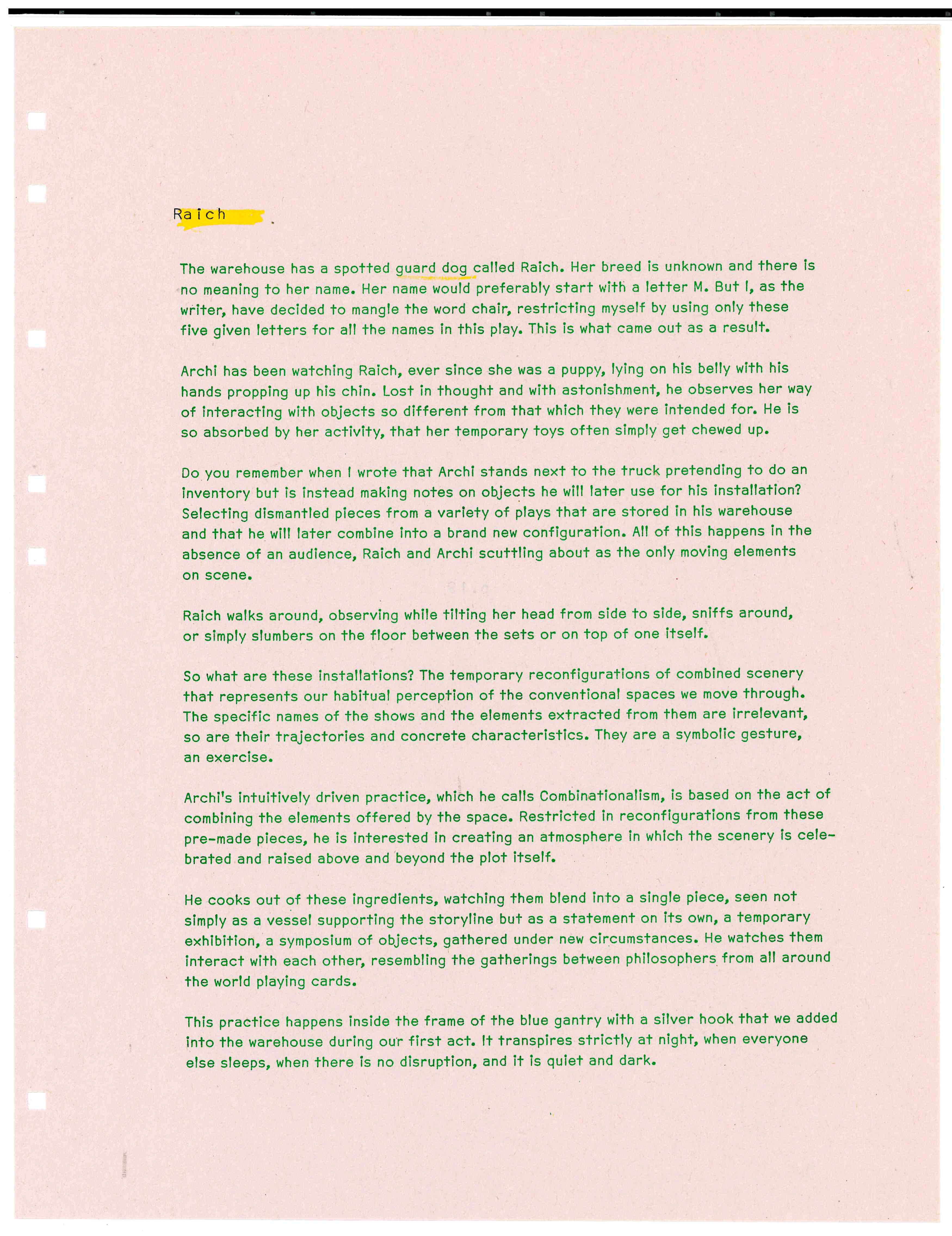
This is the result of my attempt to digitize Dual Gothic, originally constructed for the IBM Selectric typewriter. This particular typeface spoke and still does speak to me. It, with its playful and curvy details fits my creations and my way of constructing in general. I challenged myself to generate a proportional rather than mono version, which I later used in my MFA thesis book called Awakening Chair. The name 3200dpi_uncoated comes from the process, referring to the scanner's setting I used and final paper I picked (with Nina's help) and typed on with the mentioned Dual Gothic. I later selected letters that fitted the collection I envisioned, and I did my best to retain the smudgy feel of the ink on the paper by imitating stain–y tactile marks with "blurry" pixels on the screen.
