Jun Jung
Henri
Source material: Hendrik van den Keere’s Two-Line Double Pica Roman (1573)
Spring semester 2020
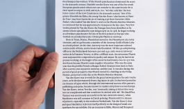
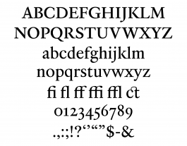
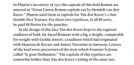
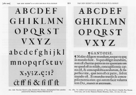
I was first fascinated by the big x-height that the original specimen has as it makes the letterform look contemporary even though the punch was cut more than 440 years ago. Fournier le Jeune called Romans with such style “le gout Hollandais (meaning: the Dutch taste)” where I found why I was so much drawn to the specimen.
