Katie Johnson
Stirling
Source material: Caledonia (W. A. Dwiggins for Mergenthaler Linotype, 1938)
Spring 2024
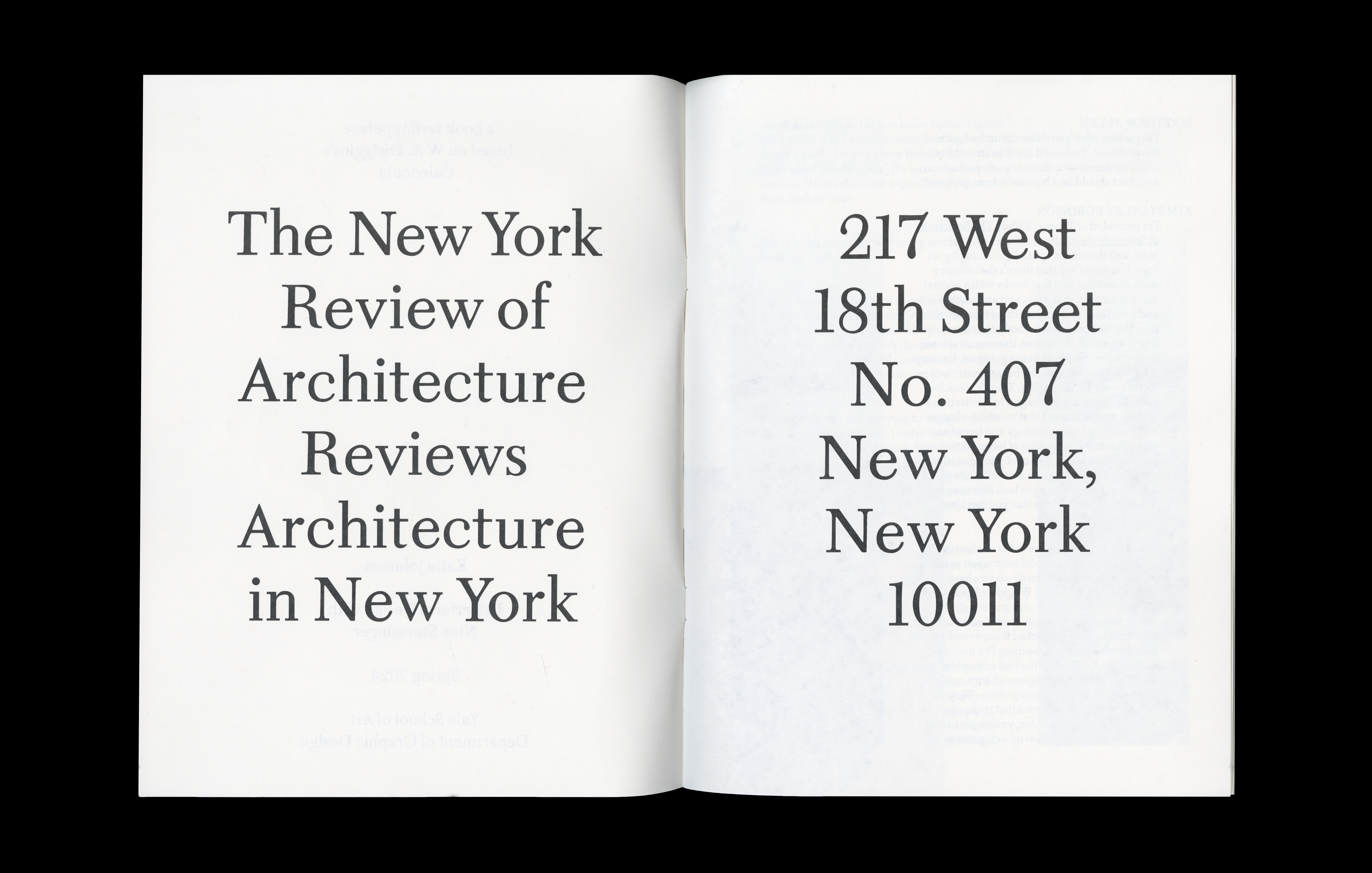
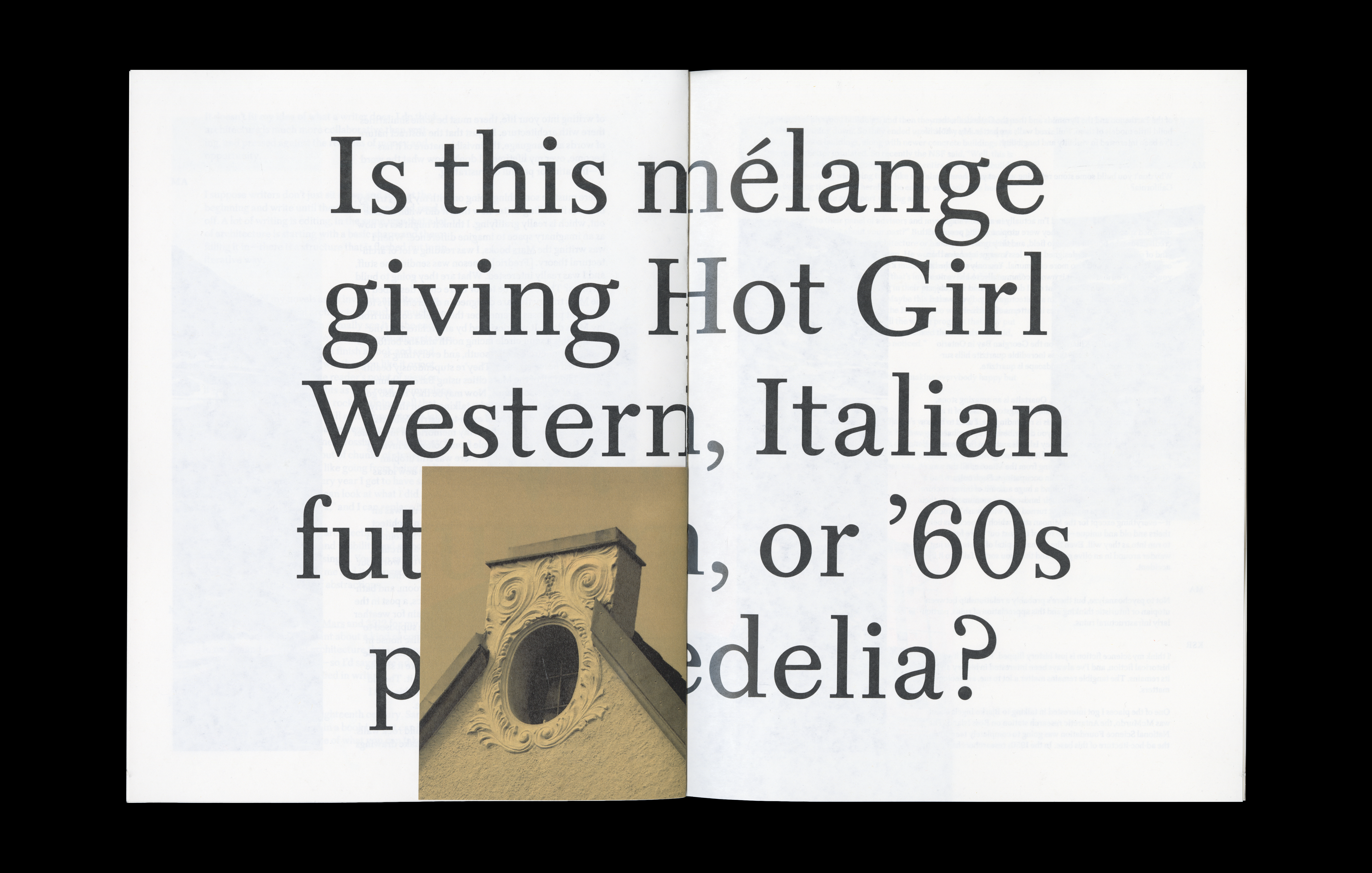
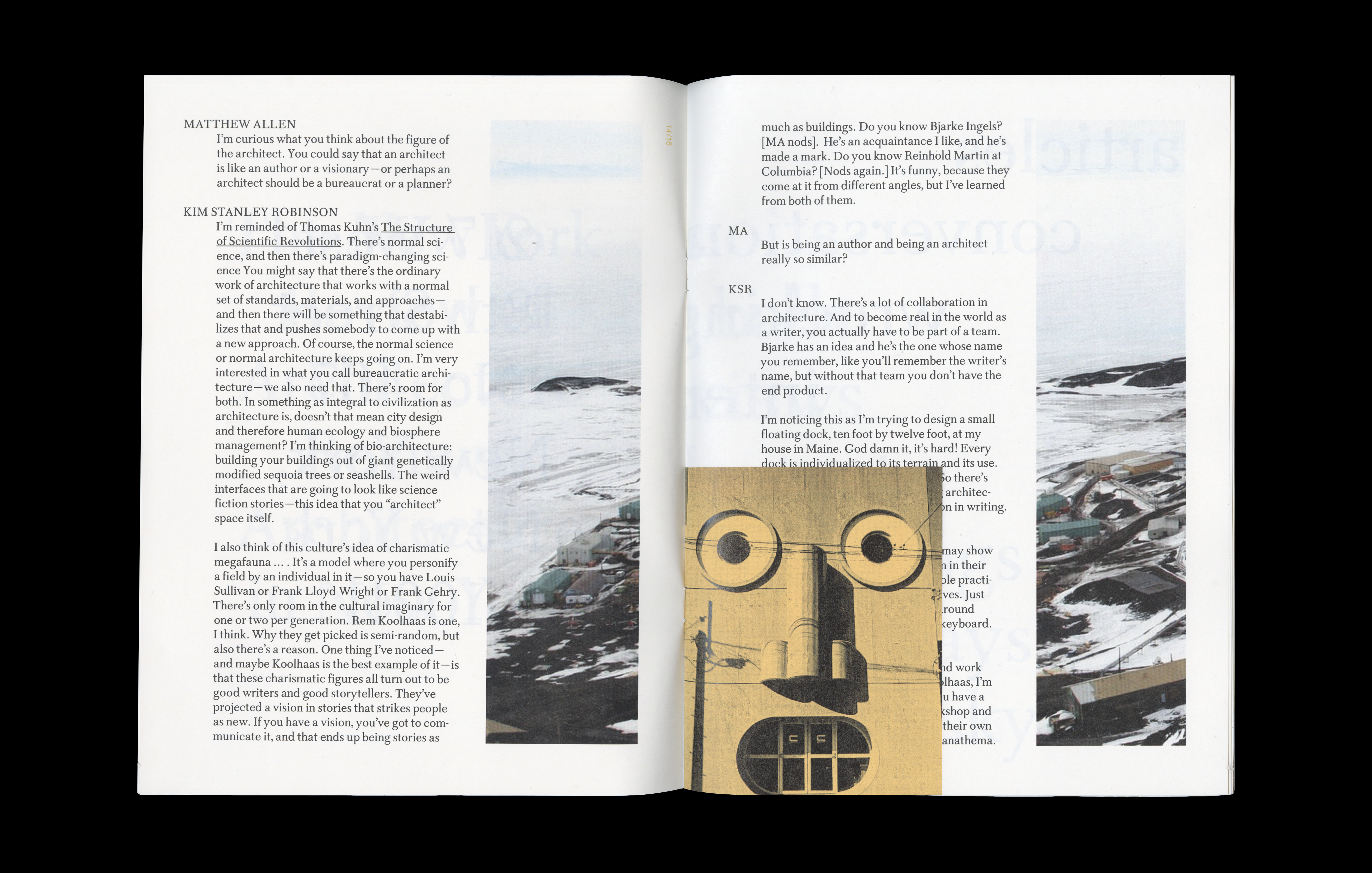
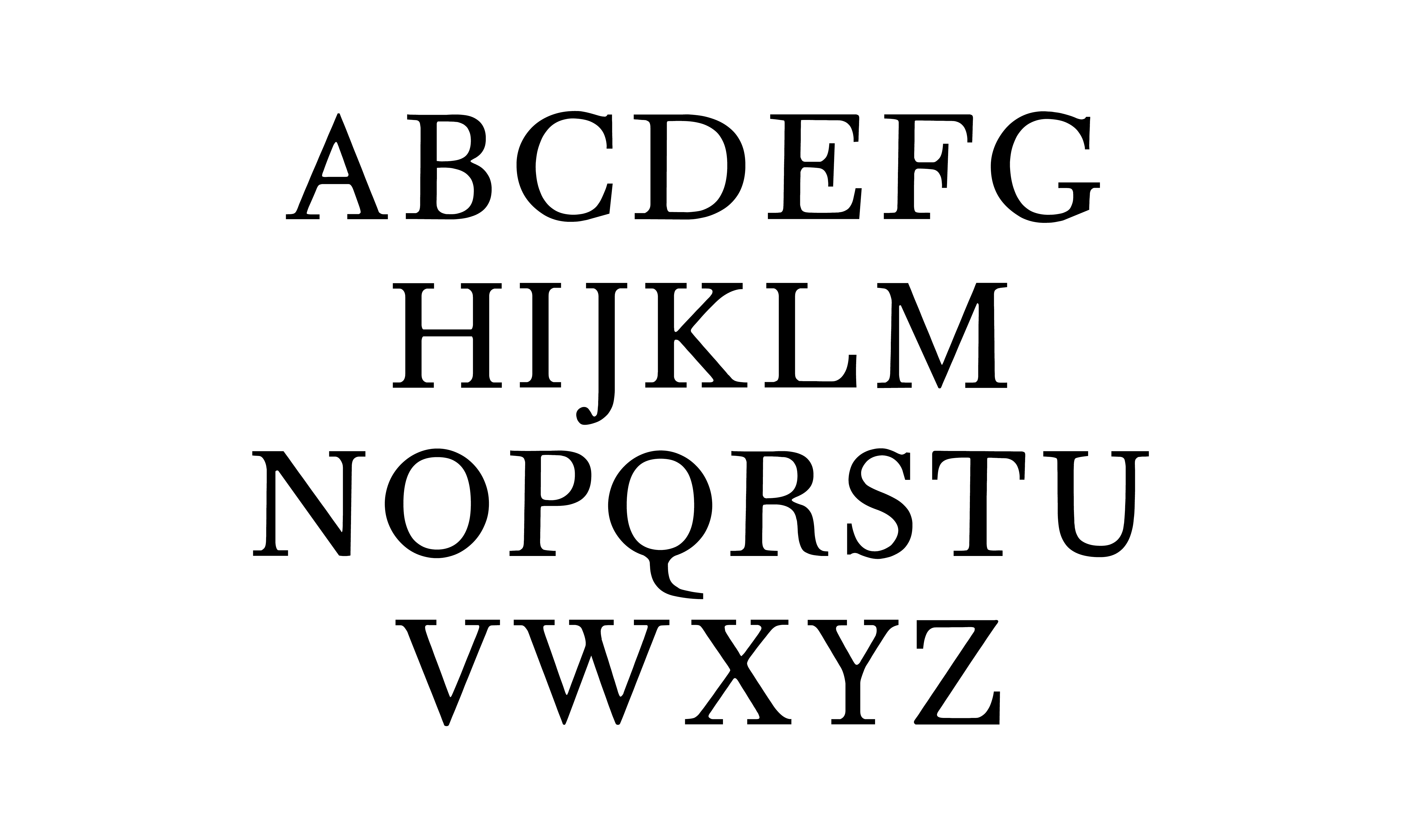
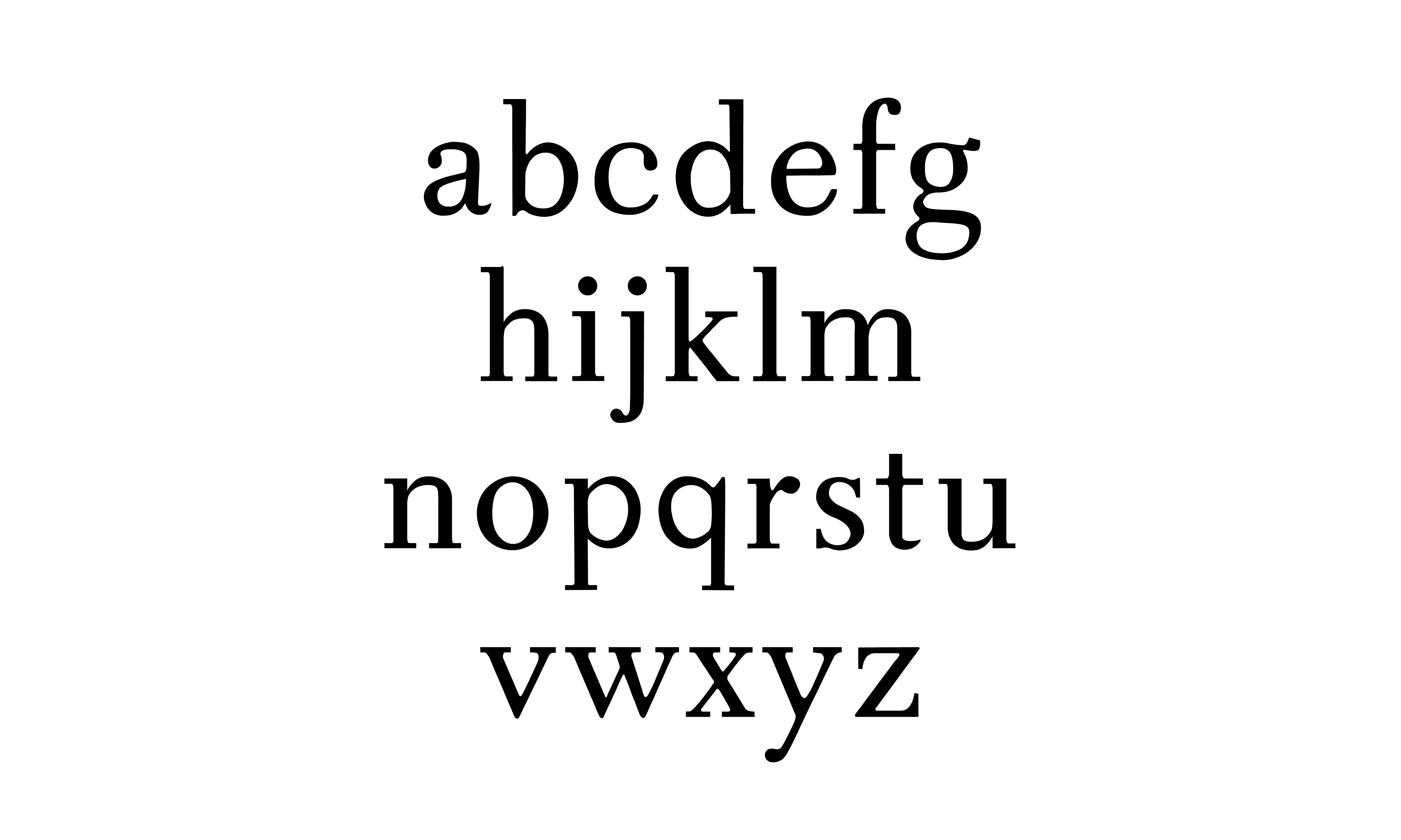
For this project, I wanted to design a legible book face with character that doesn’t rely on trendy details or gimmicks to inject personality. I was also interested borrowing from the angular curves of certain Scotch Modern typefaces, like Columbia Antiqua, but significantly toning down the high contrast and decorative qualities to create something more versatile. W. A. Dwiggins’s Caledonia, which he called a “Scotch Roman,” felt like a good example of a typeface that accomplishes a lot of those goals, and served as my source material.
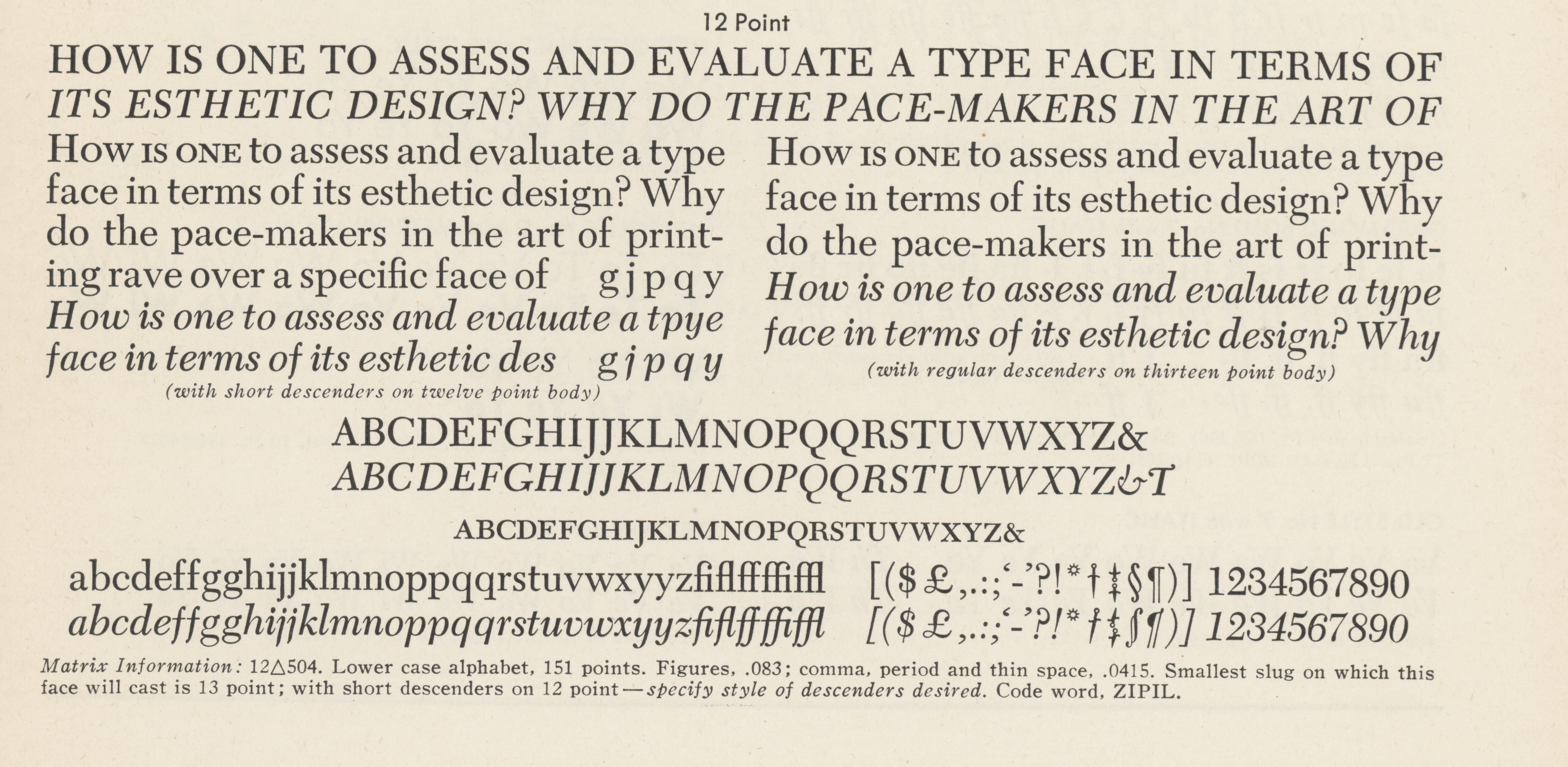
My reinterpretation of Caledonia takes from both the softness of the ink on the pages of the original specimen, and the sharpness of a digital drawing—I rounded the concave corners of serifs, crossbars, and concave points such as those on the lowercase “g,” but added sharp corners to the serifs’ terminals. I also lowered the overall contrast, straightened the serifs (which in the original are slightly curved), and emphasized the angular curves that make Caledonia unique.
