Mengjie Liu
Bruce No. 16
Source material: No. 16 (Bruce Type Foundry, 1901)
Spring semester 2021
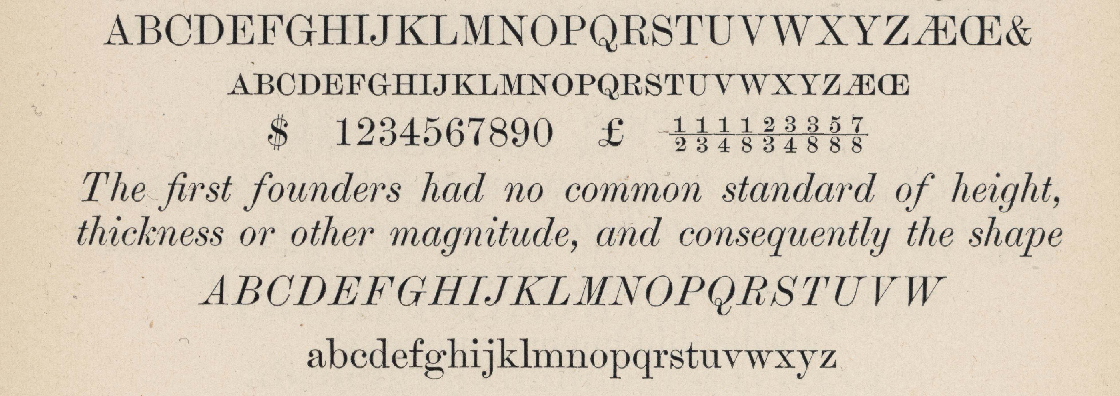
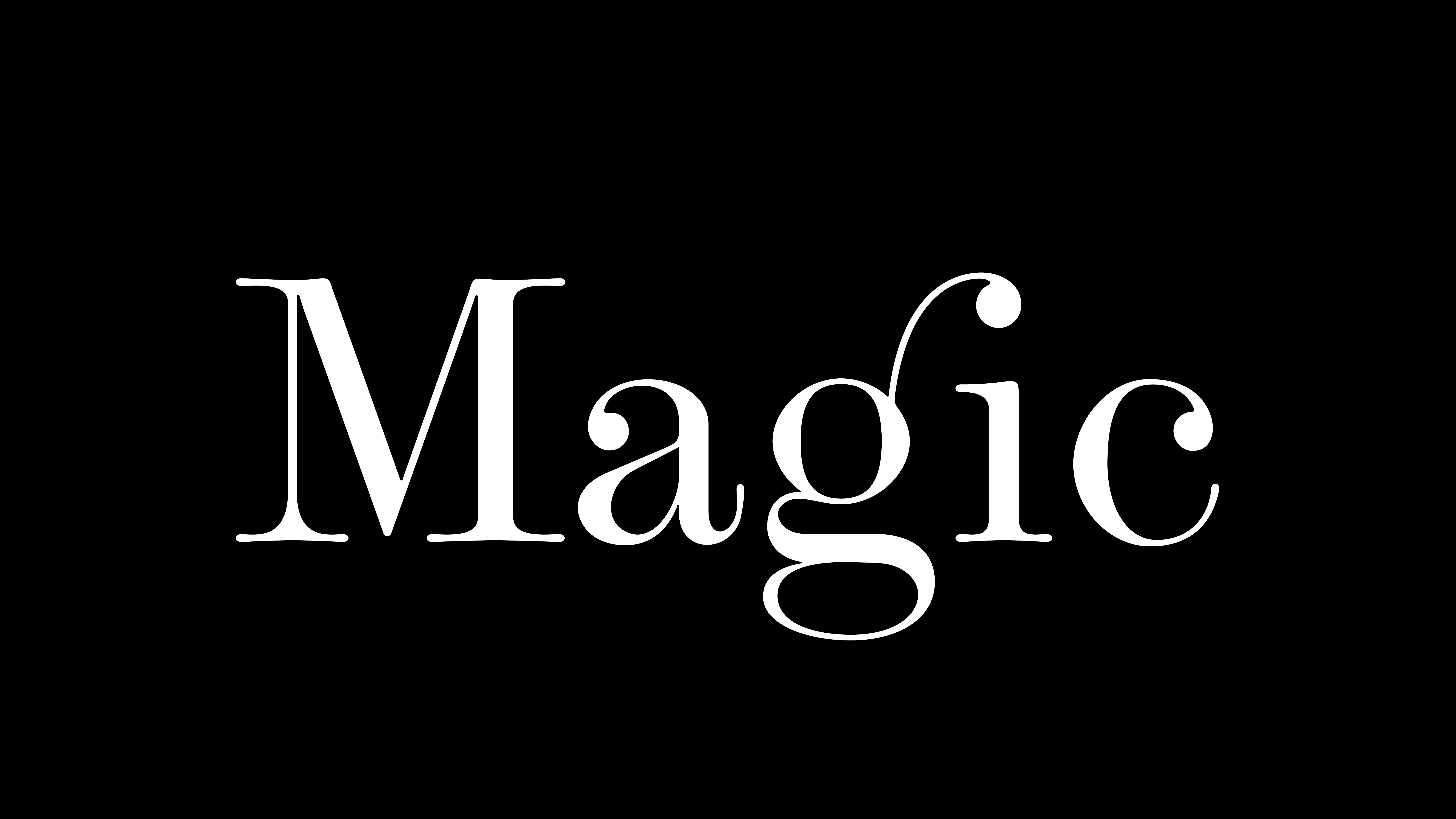
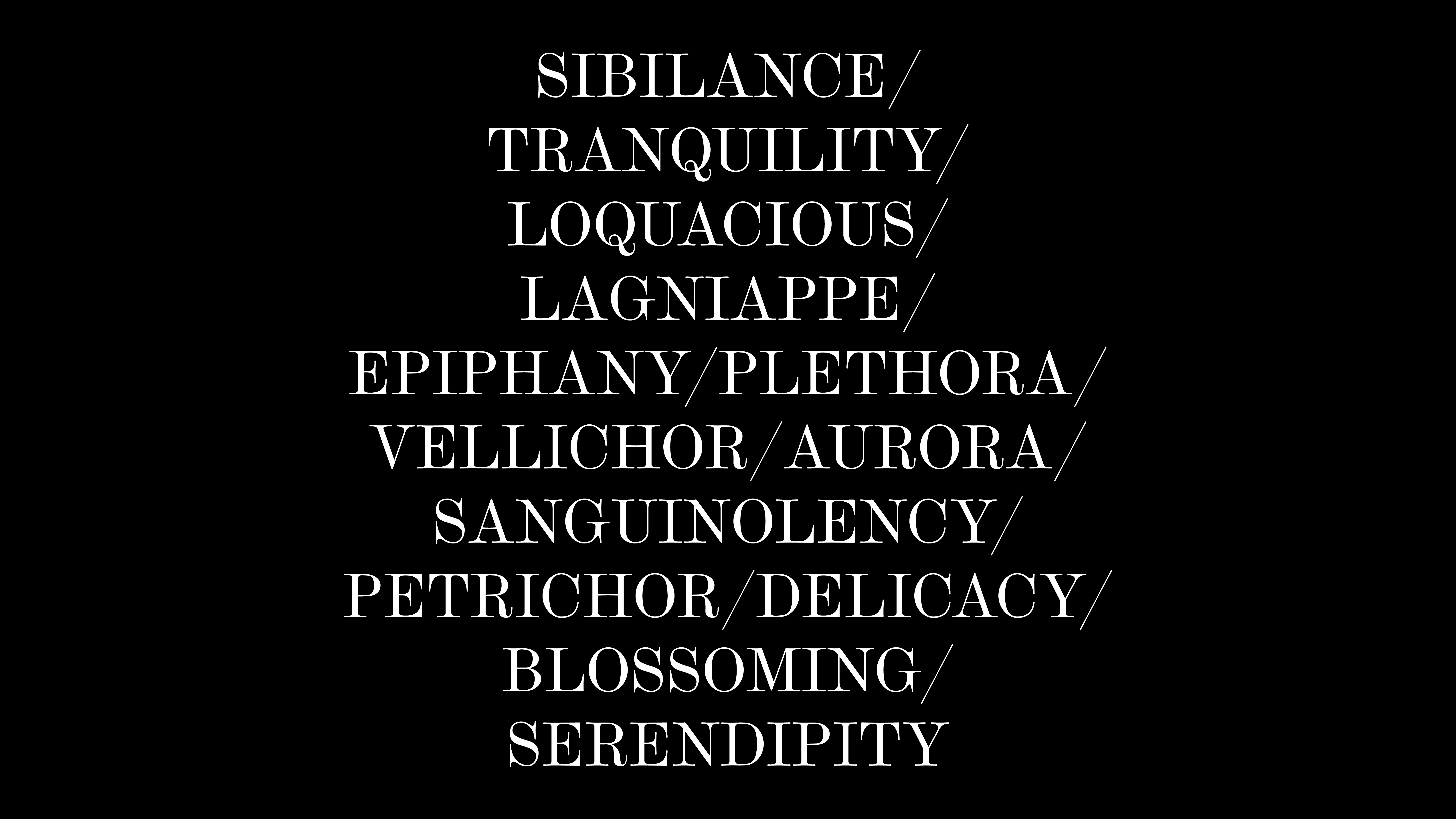
What first attracted me to the style No. 16 was its expressive round terminals and bold contrast between thick and thin strokes.
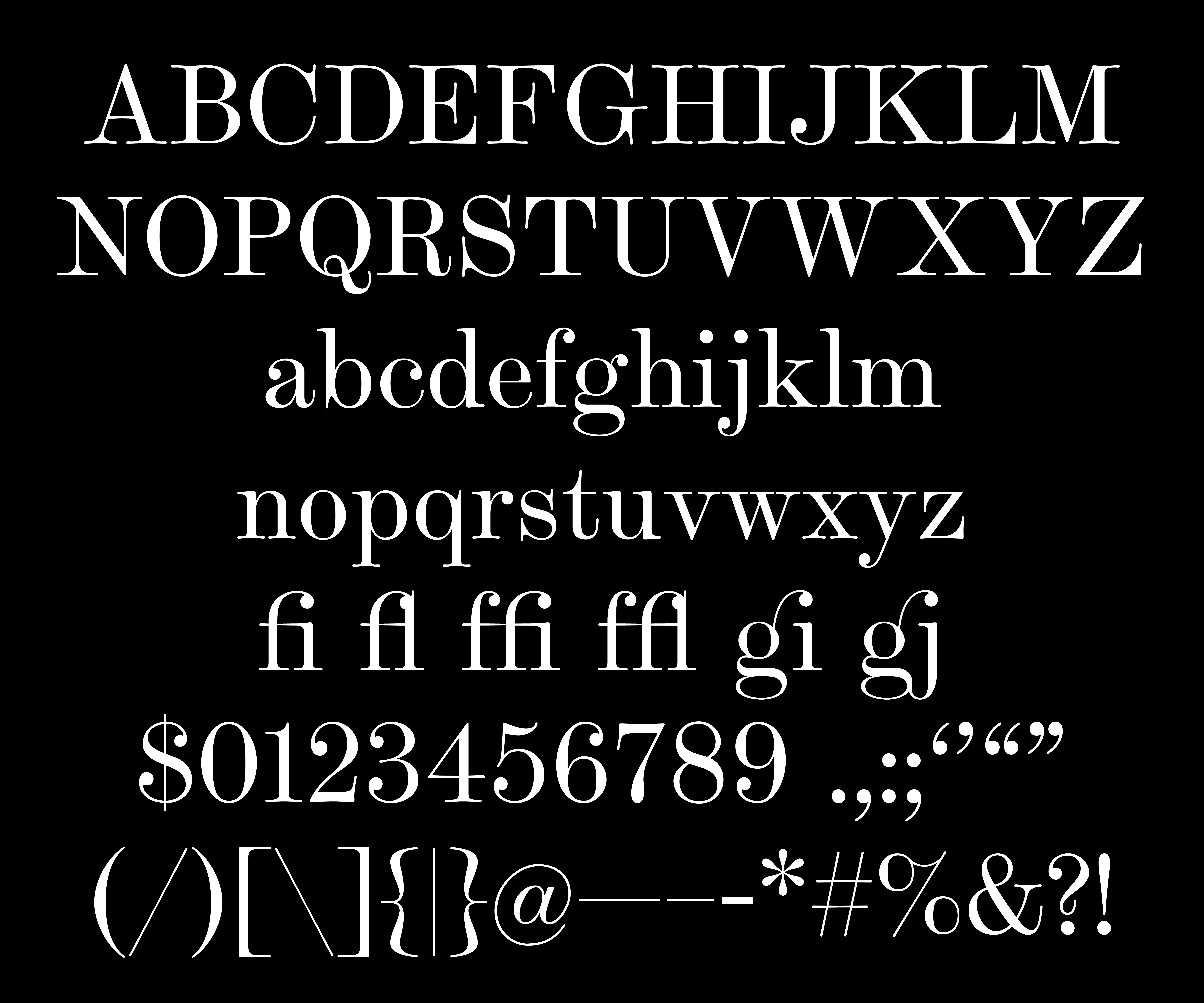
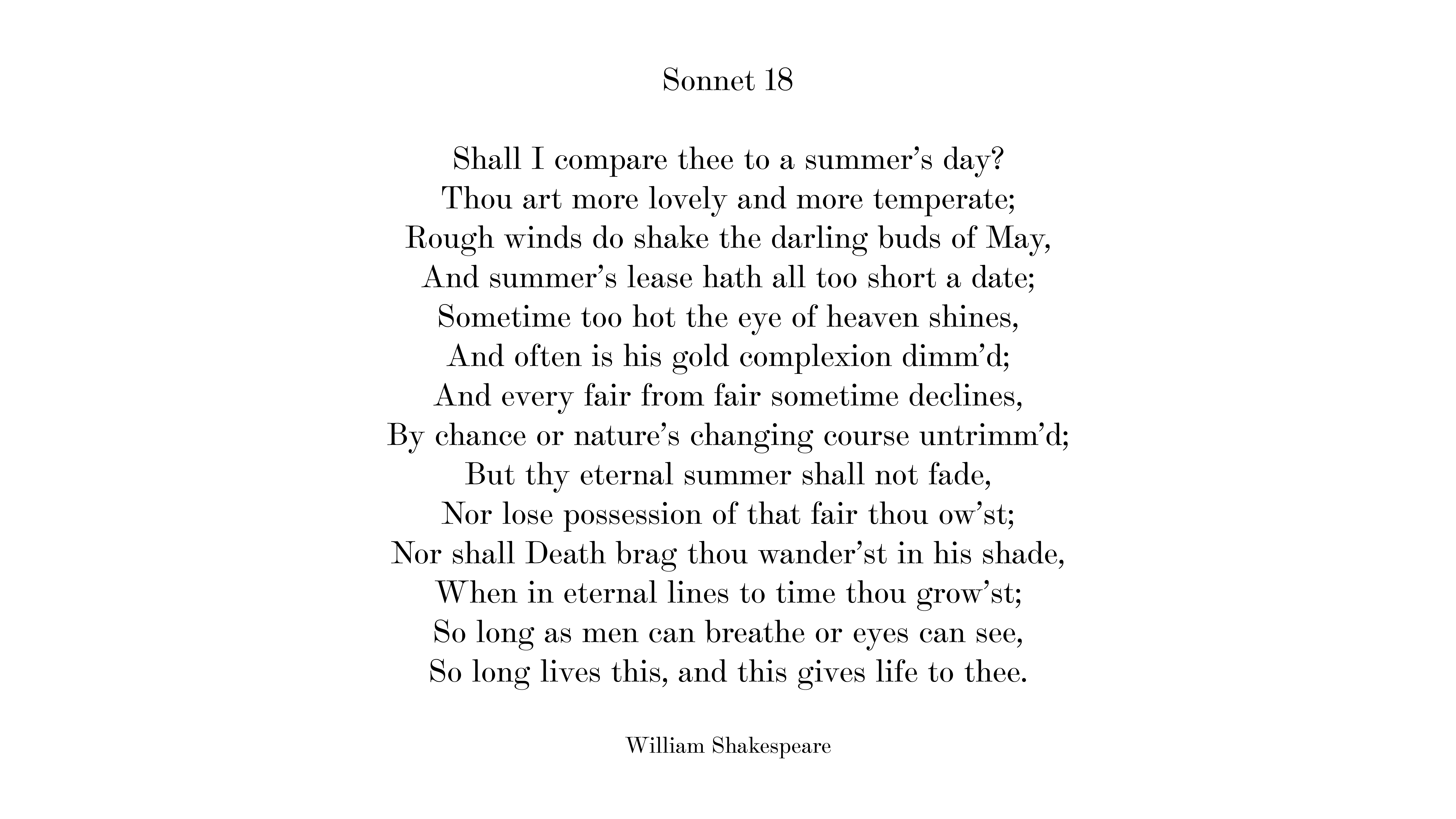
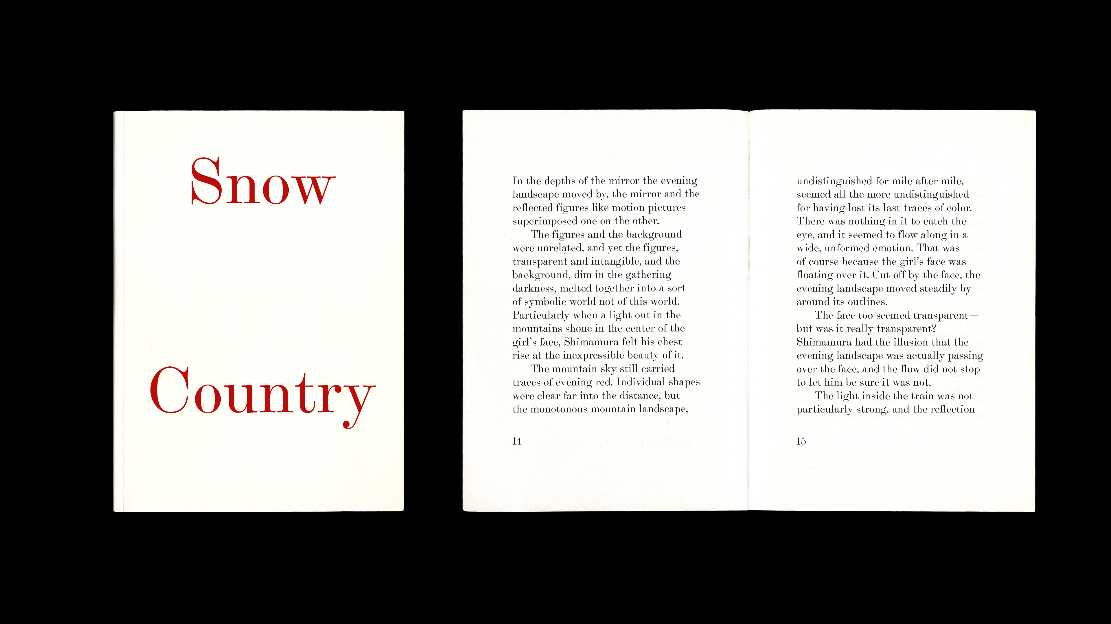
As I started to draw it in 14 pt, I found the squashy quality caused by the ink went along well with its wide serifs, adding more playfulness and elegance to its existing characteristics.
