Nick Massarelli
Grotesque No. 6
Source material: Grotesque No. 6 (Stephenson & Blake, 1880–82)
Spring semester 2020
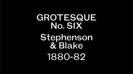
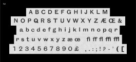
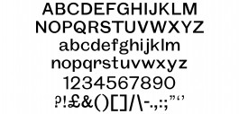
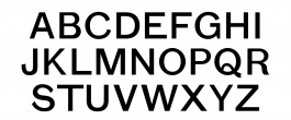
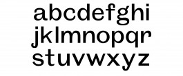
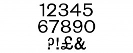

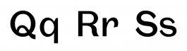
I wanted to draw a late 19th century sans-serif. I was thrilled when Nina pointed me towards Stephenson & Blake's Grotesque No. 6. I decided on No. 6 because I wanted focus on forms that had a subtle contrast in weight, rather than the other grotesques which seemed to either be condensed or wide. I like that No. 6 leans the closest towards a mono-weight typeface but still contains all of the character of a grotesque.
These student typeface designs created at Yale School of Art are noncommercial academic projects, commonly revivals or reinterpretations of historical typefaces. Read more about these typeface design courses at Yale School of Art.
© 2020–2026 Yale School of Art. All rights reserved.