Nick Massarelli
QUE
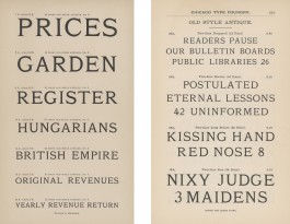
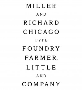
Source material: Old Style Antique (Miller & Richard, around 1860s)
Fall semester 2020
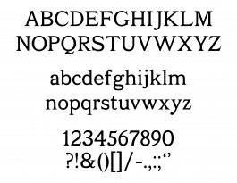
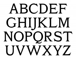
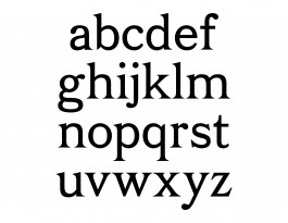
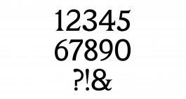
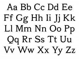
When I first came across the Old Style Antique specimen I was attracted to its low contrast letterforms with dramatic serifs. These long serifs and heavy curves give the straight lines a rounded effect where each letter hugs those around it. I found about three or four different Old Style Antique specimens, all from different foundries, all with very little or no lowercase, numerals, or punctuation. Tobias suggested that I look to Franklin Old Style for the lowercase forms. From there I reduced the contrast between the thick and thin moments and matched the serifs to the shapes seen in the Old Style Antique capitals.
