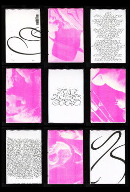
Osvald Landmark
SWINE
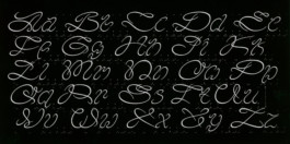
Source material: Granjon Courante+Bastarde (Carter&Vervliet repro 1966 | 1800)
Spring semester 2021
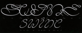
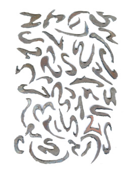
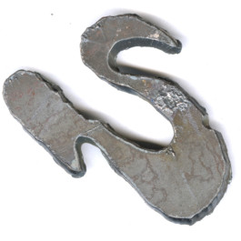
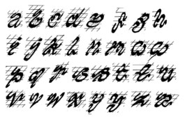
SWINE is elegant yet overwhelming and needs a lot of space to thrive as a display font, but also does well in very tightly spaced sentences, even though the readability might go down. The first visual explorations for SWINE was cut in metal and thereby the automatic gestures of drawing with a broad pen or pencil was removed. It was later reintroduced to historical traditions of lettering ways of the broad pen + classic angles of contrast.

