Yuseon Park
CushingNo2
Source material: ATF CushingNo2 (1901, 1906, 1916)
Fall semester 2021
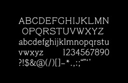

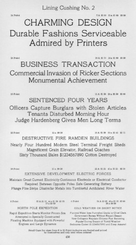
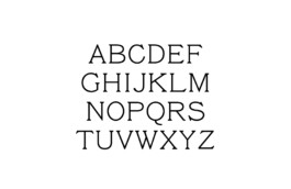
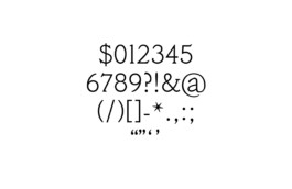
The CushingNo2 Types were among the publishing company Cushing’s typefaces. I was drawn to the delicate nature of this type and its rounded yet sturdy shapes. The clustered serifs looked like ink smears, conveying the feeling of being printed on paper. And there is almost no contrast between vertical and horizontal lines, but this neutral feeling was also attractive. The most challenging aspect of drawing this type was its standard between sharpness and rounded — I decided which moment to be sharpened and which moment to be rounded. And the original source material for these types speaks at an uneven ratio of type width. I created dynamic and constant movements within this silent writing by reinterpreting these movements. It was also meaningful to create various punctuation marks with a contemporary sensibility.


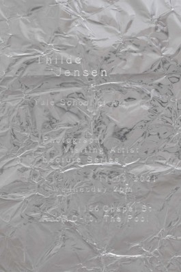
An early version of CushingNo2 is used for a poster for Thilde Jensen’s visiting artist lecture at the Yale School of Art, Fall 2021.
