Zach Reich
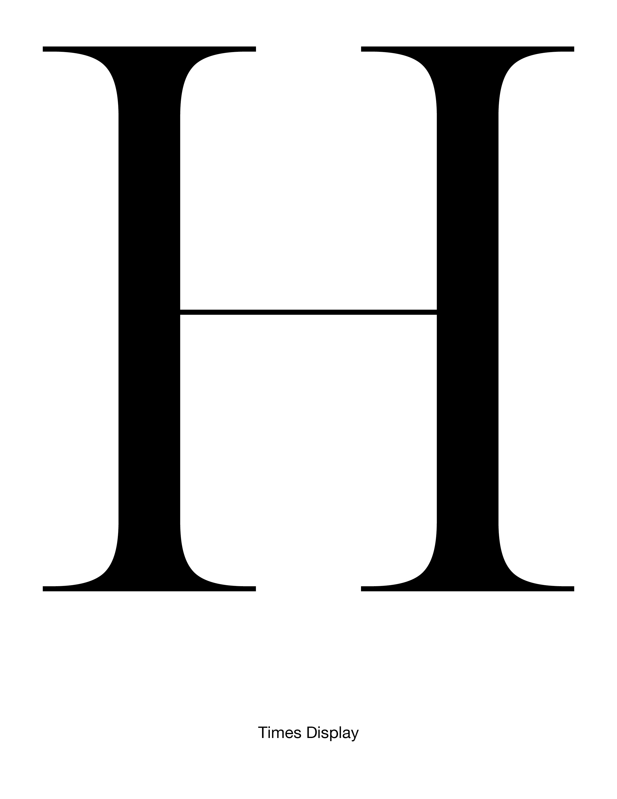
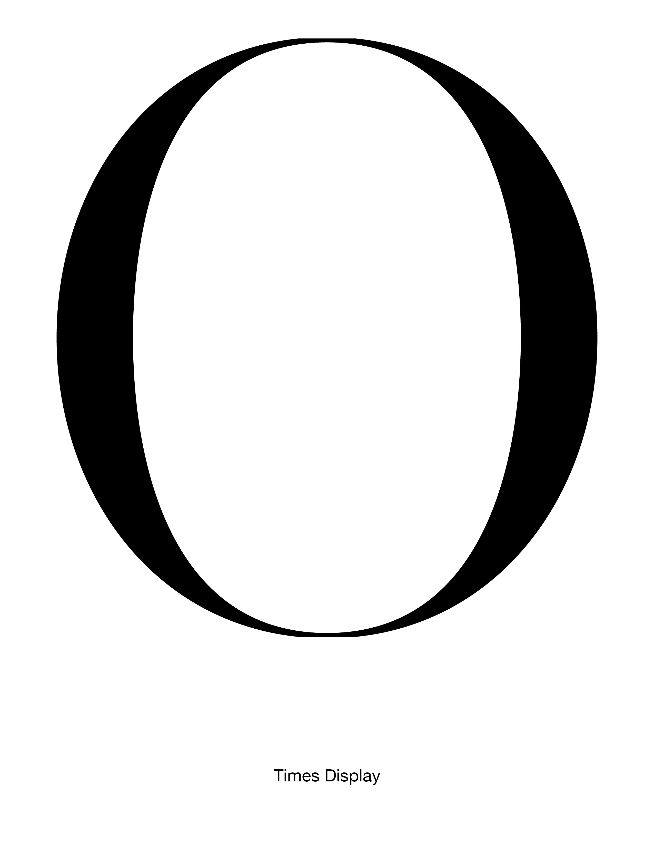
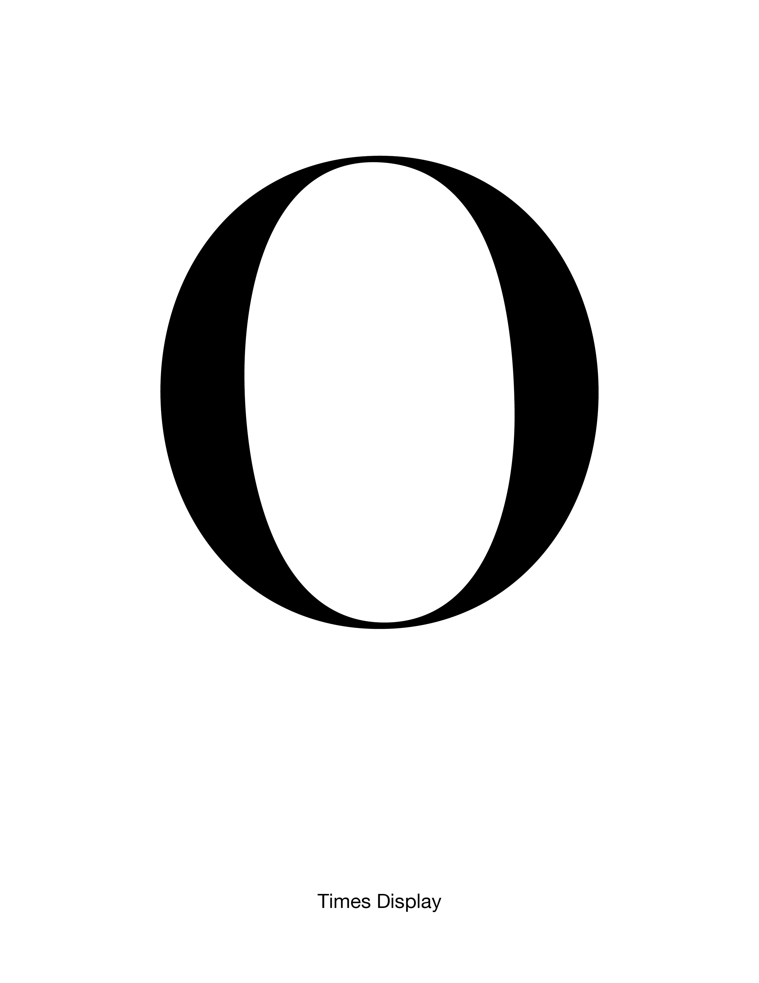
Times Display
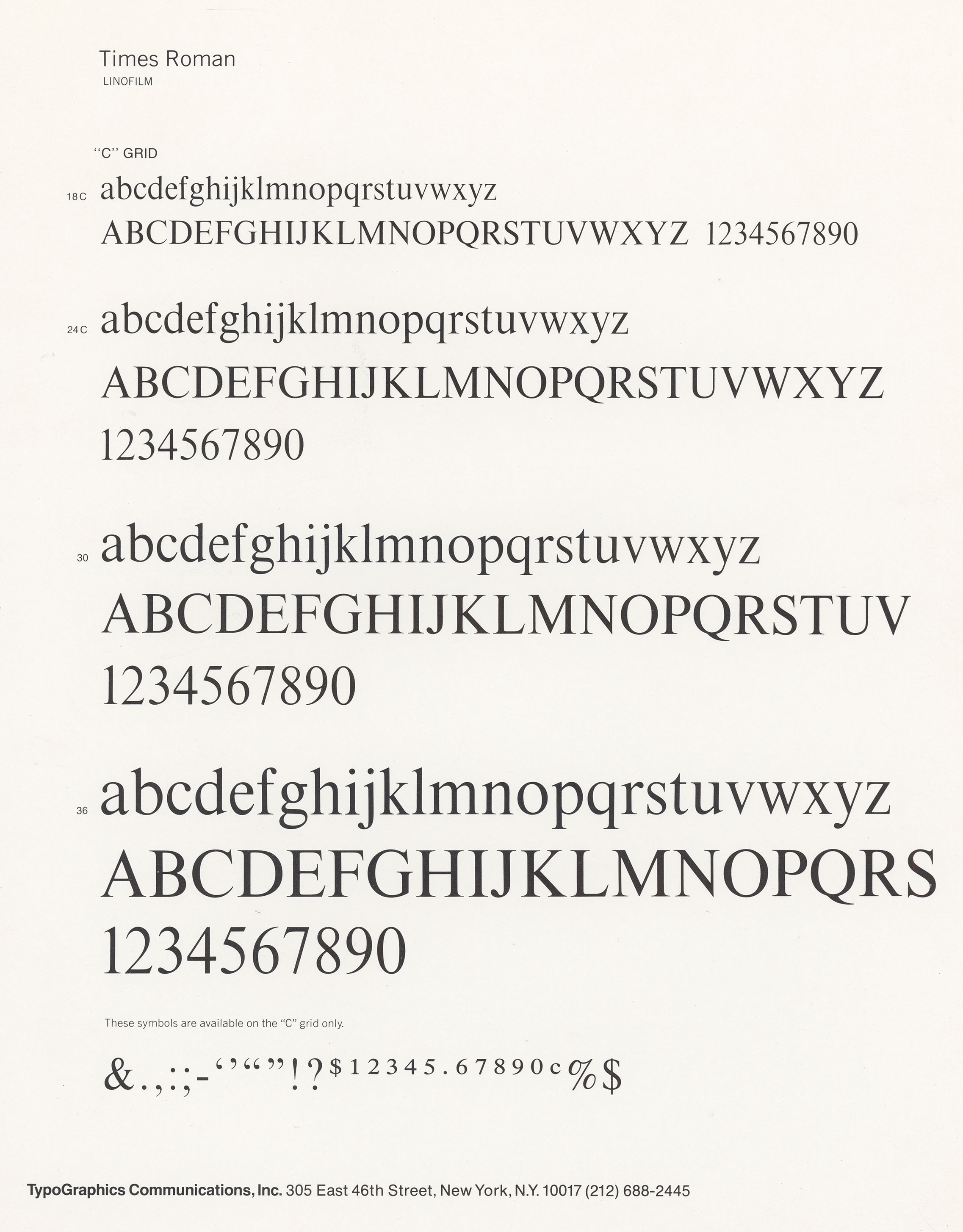
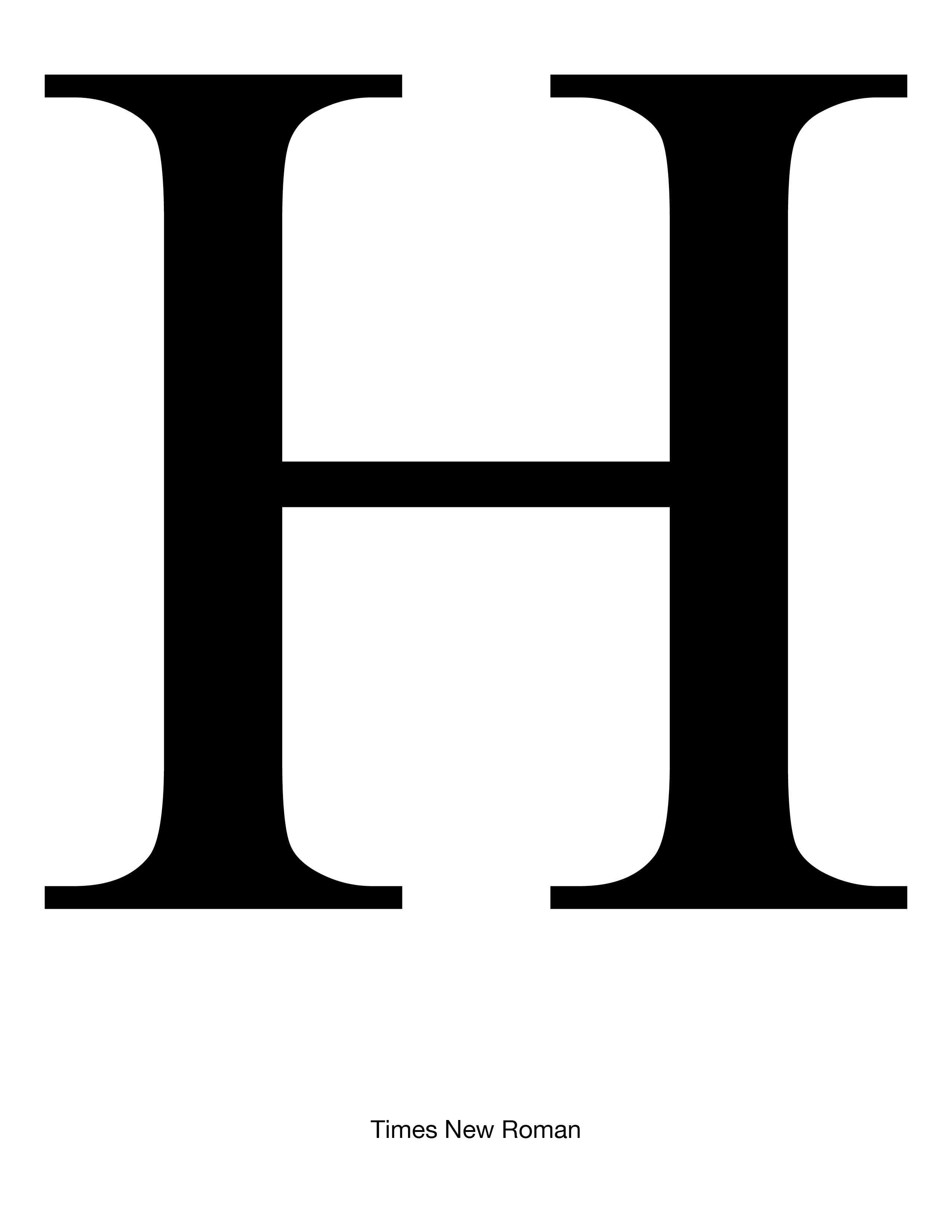
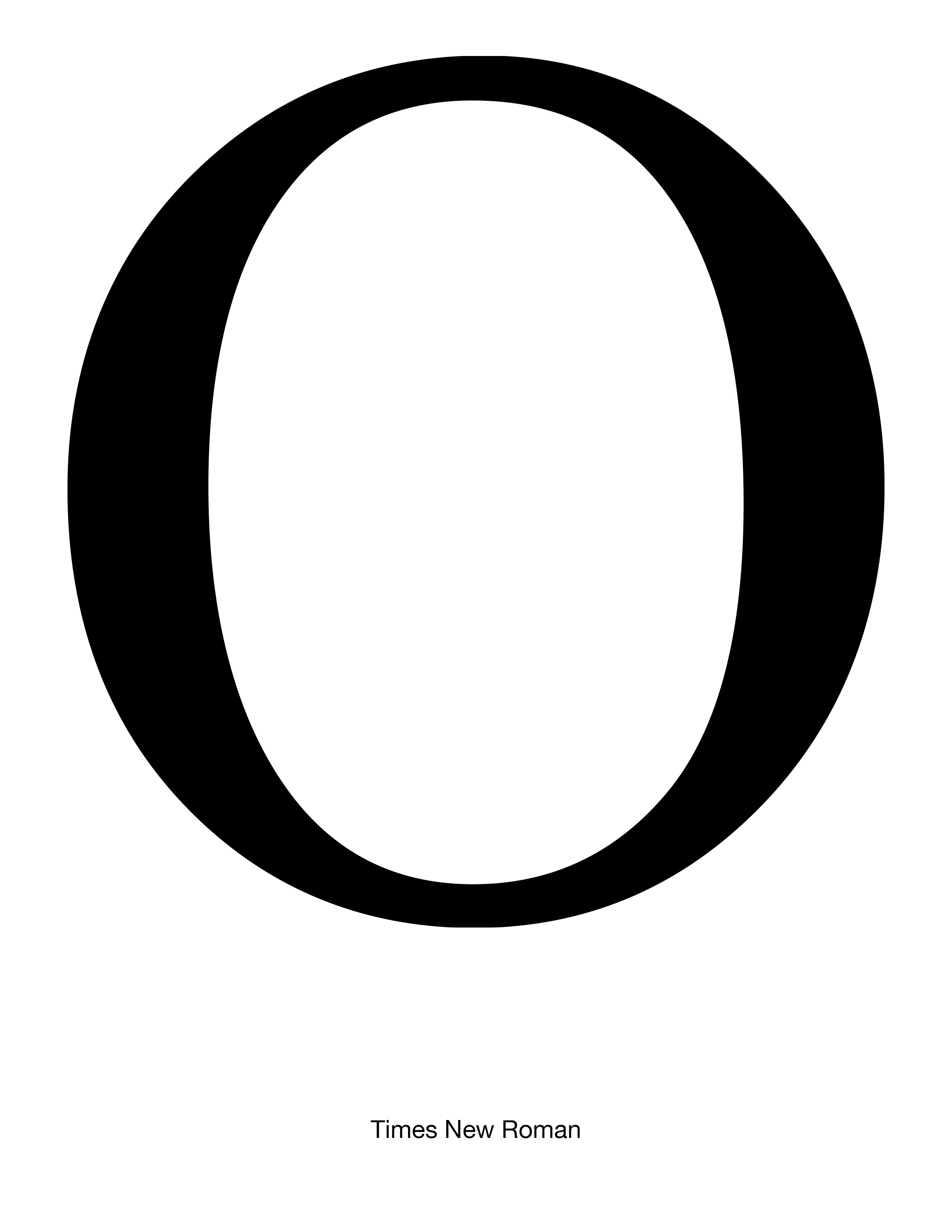
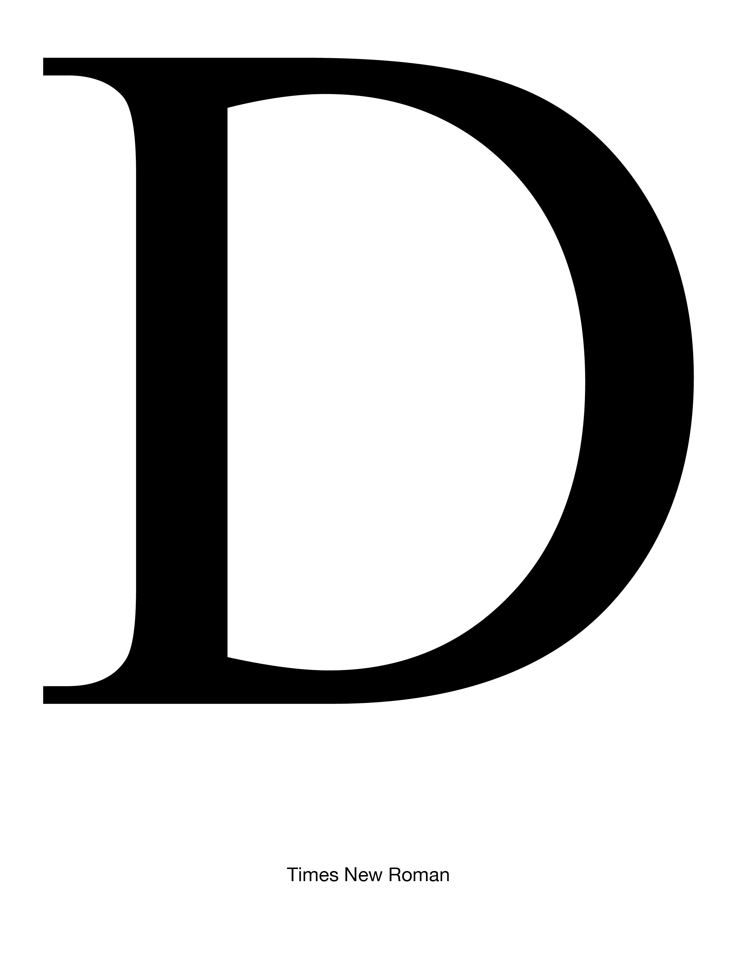
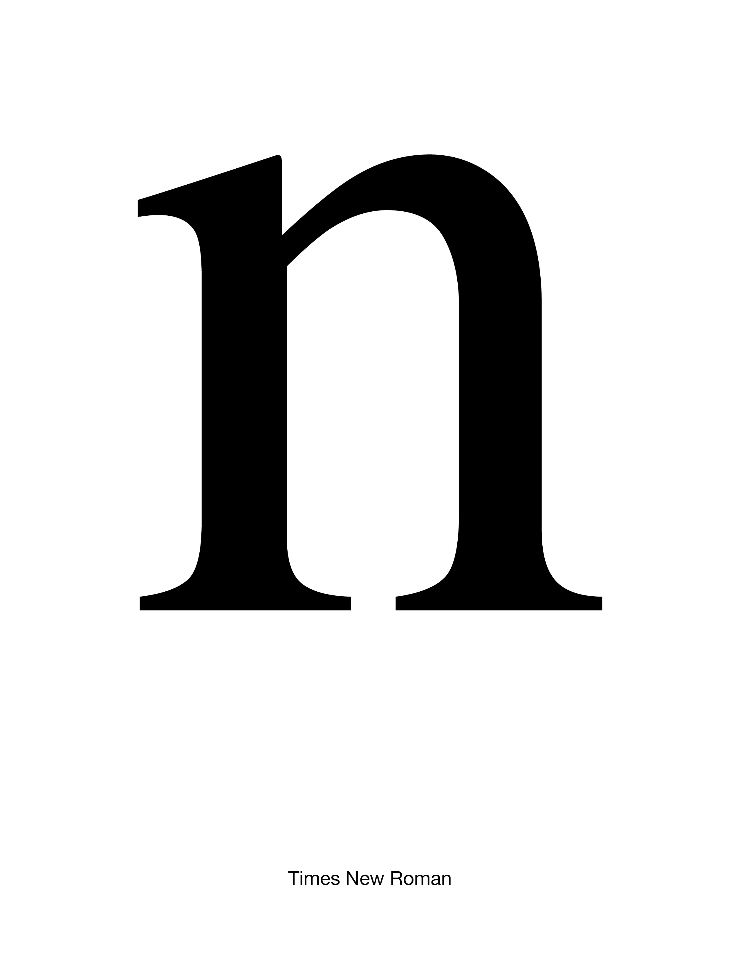
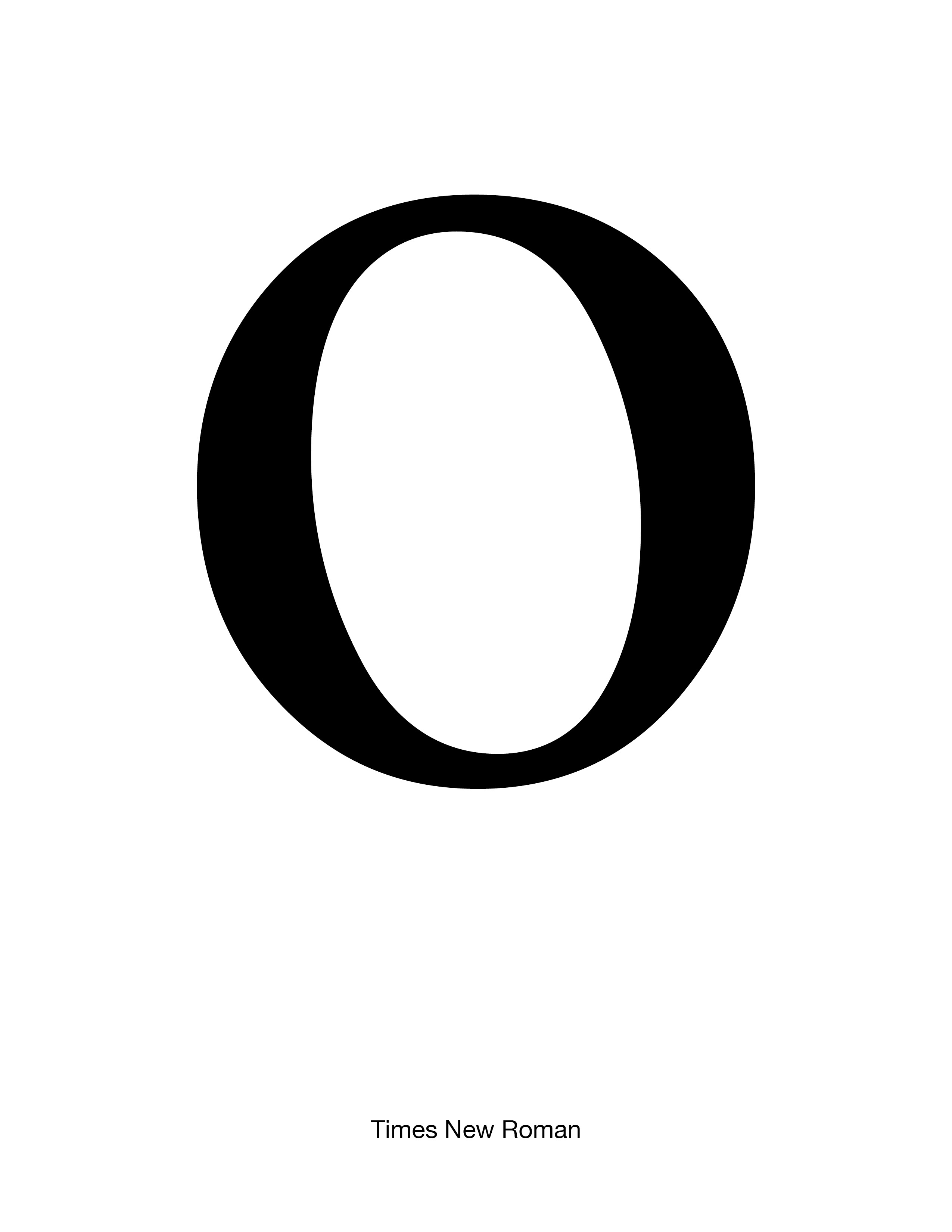
Source material: Times Roman
2743 Introduction to Typeface Design, Fall 2025
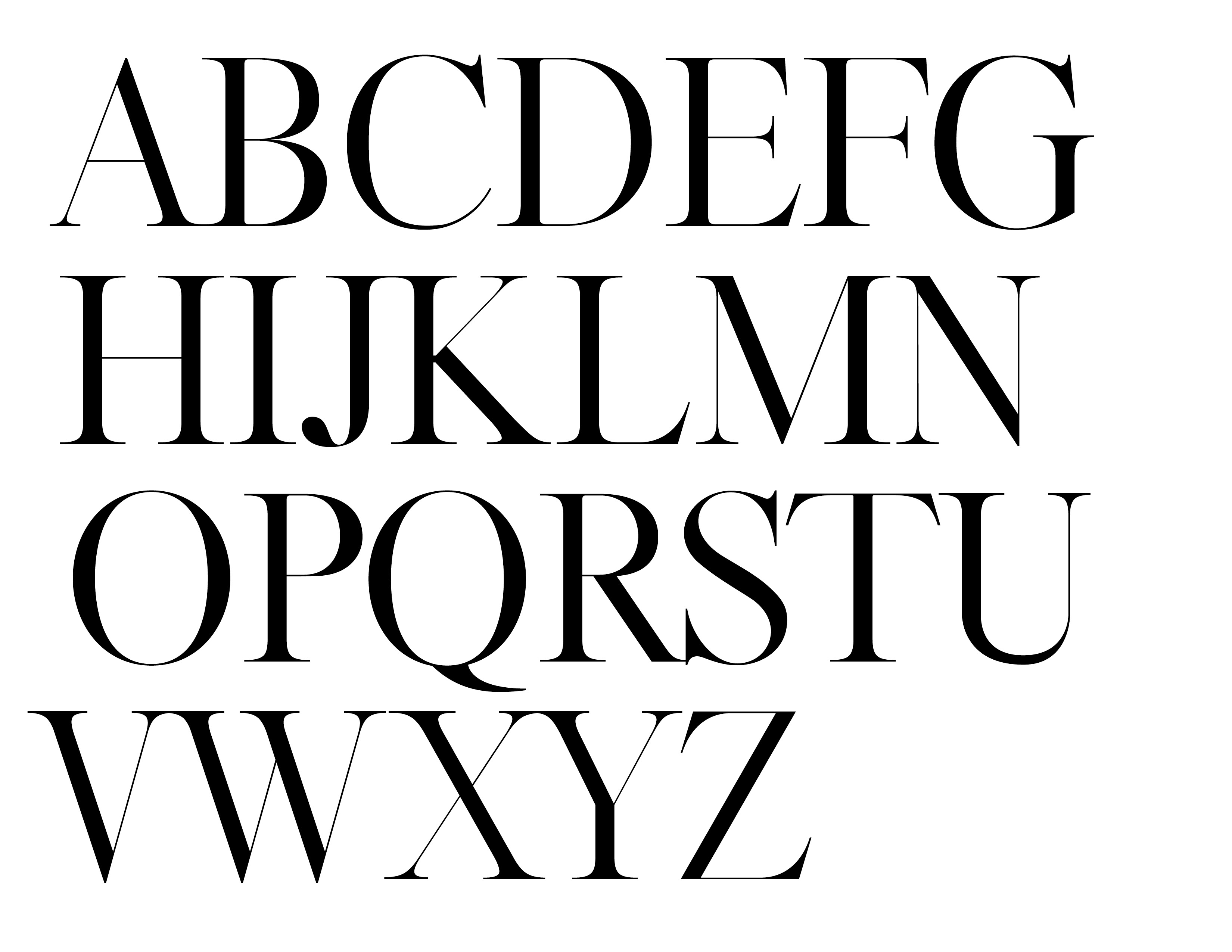
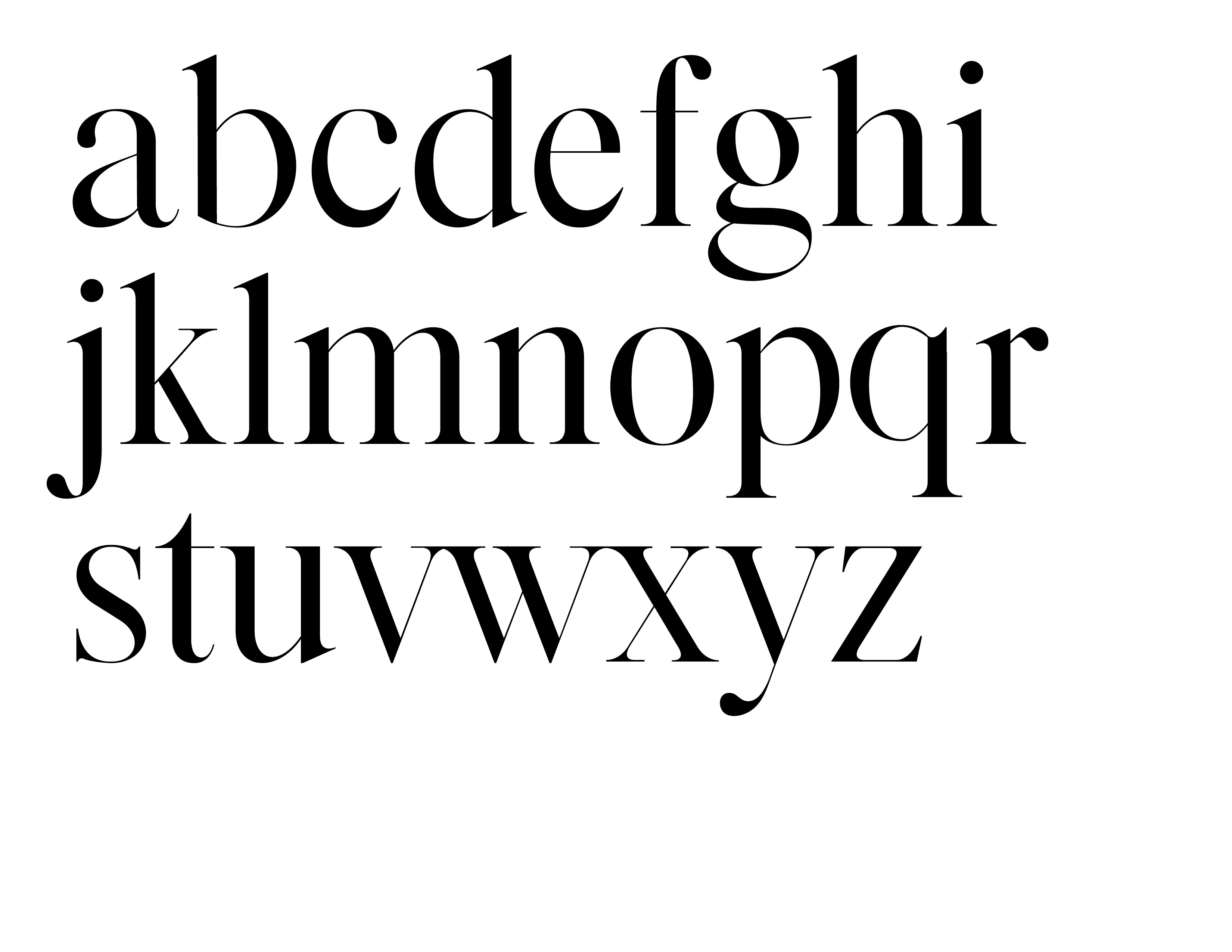
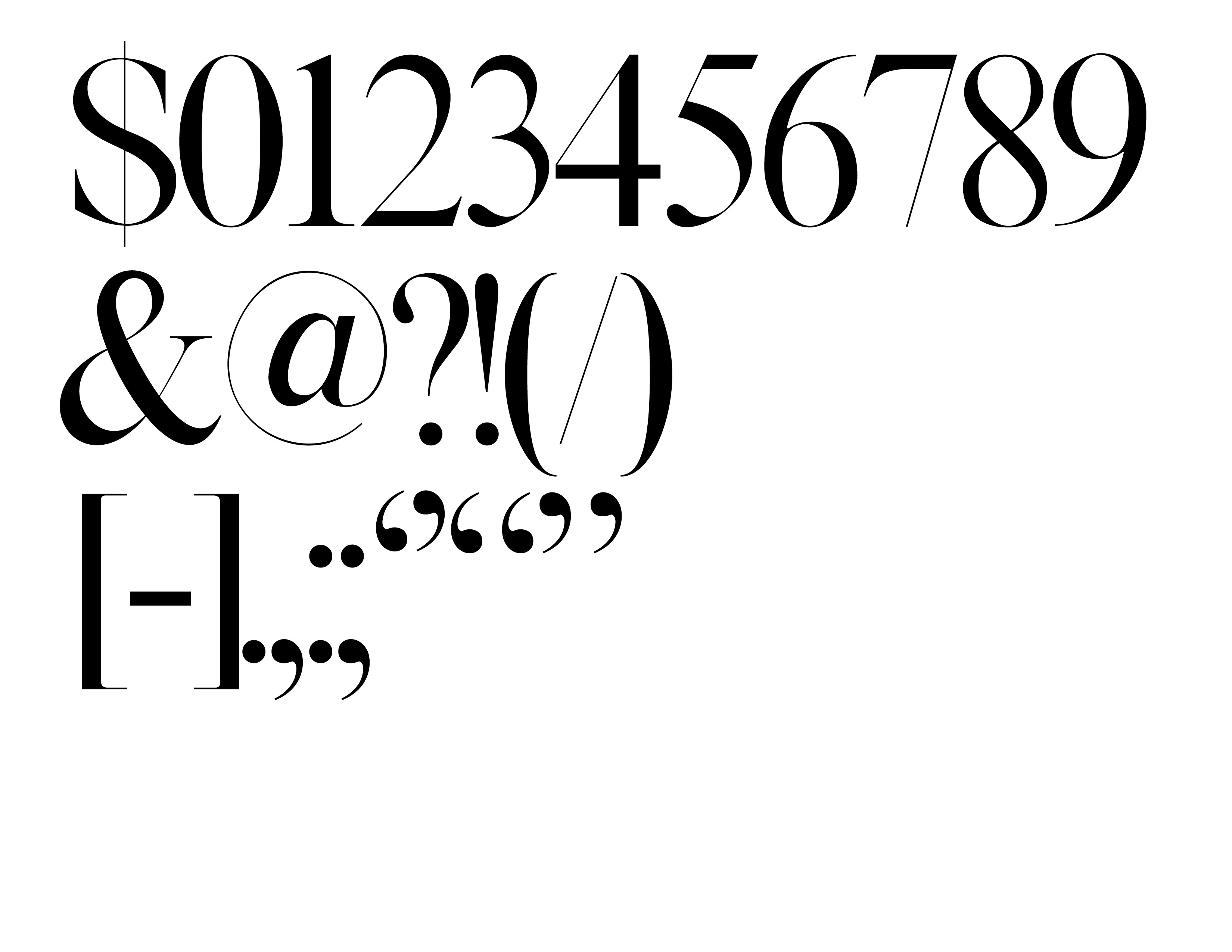
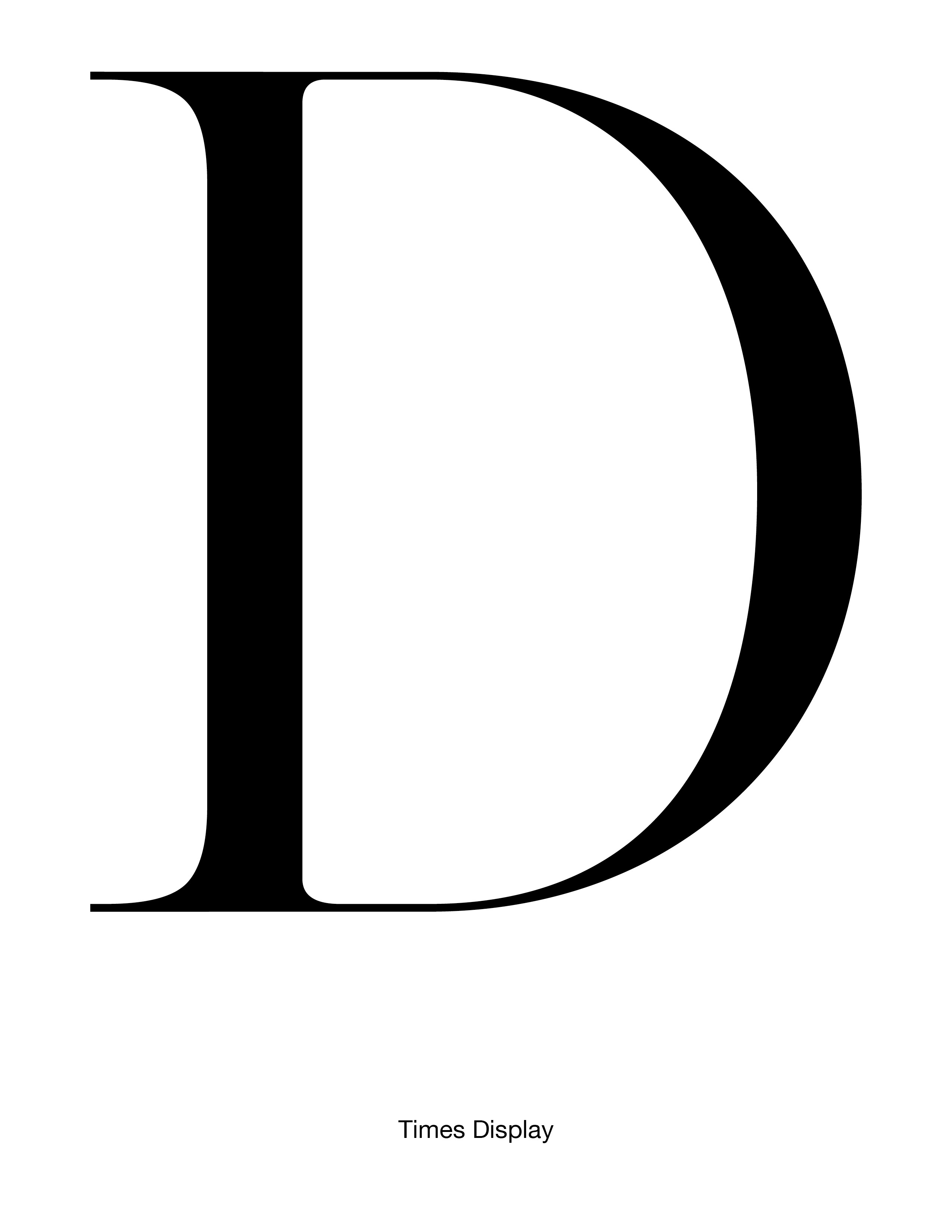
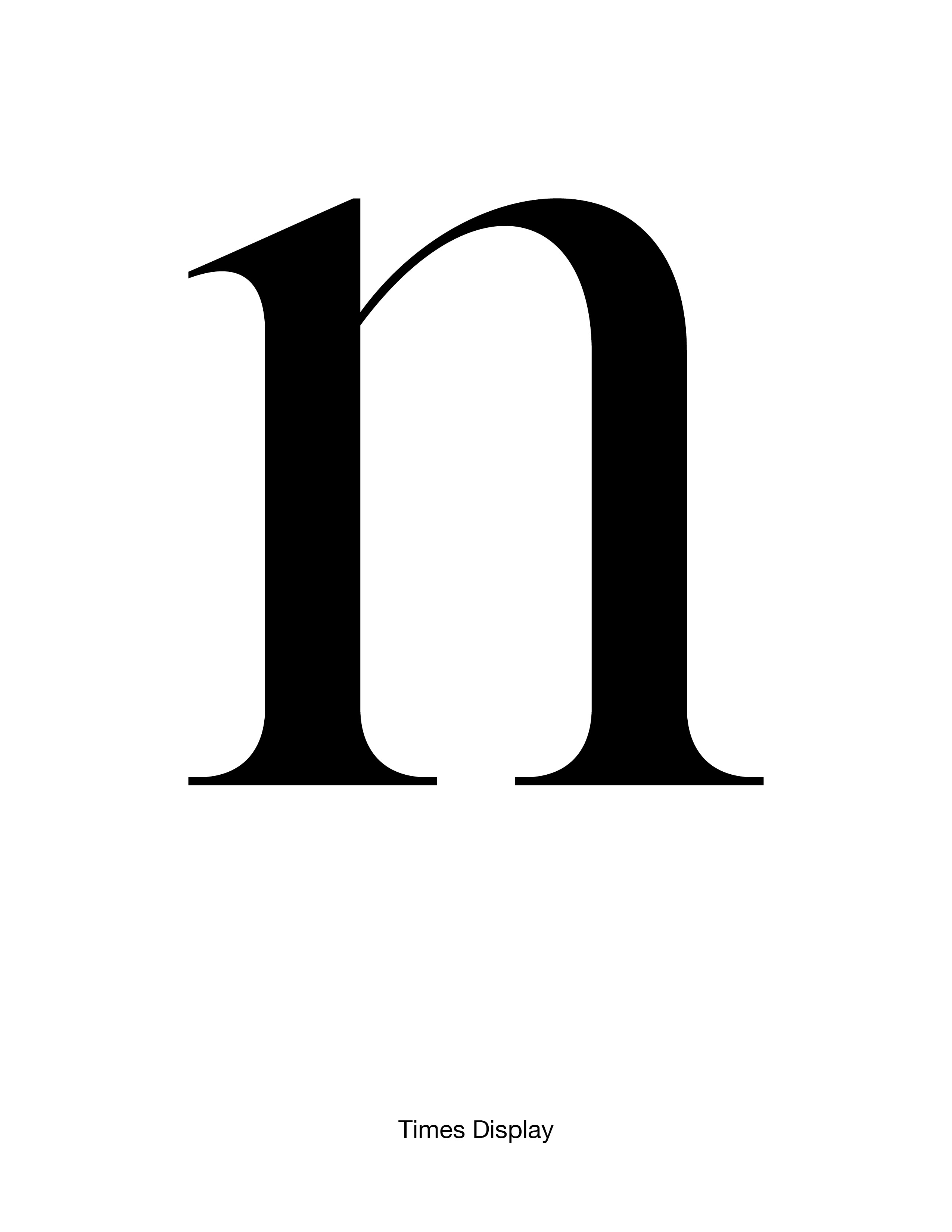
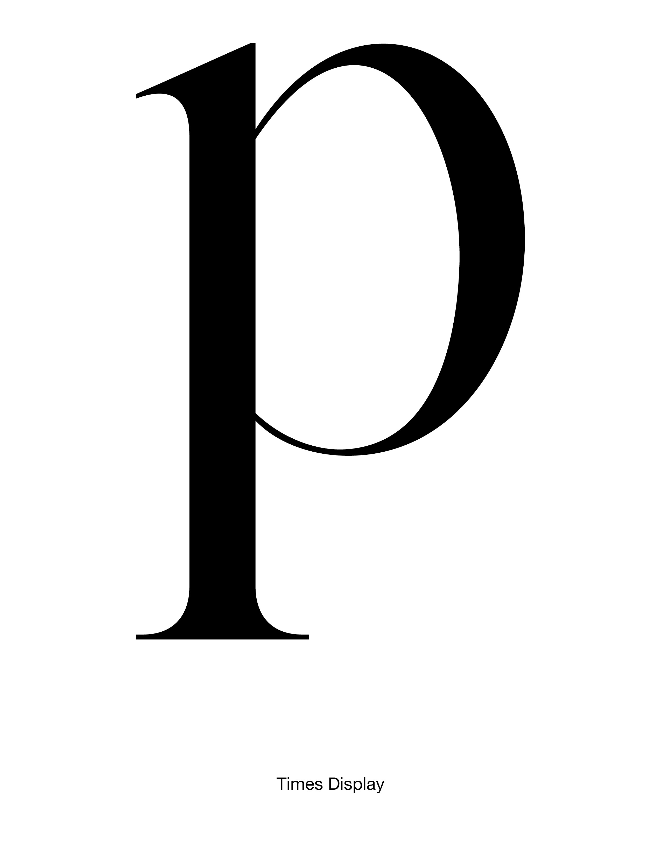
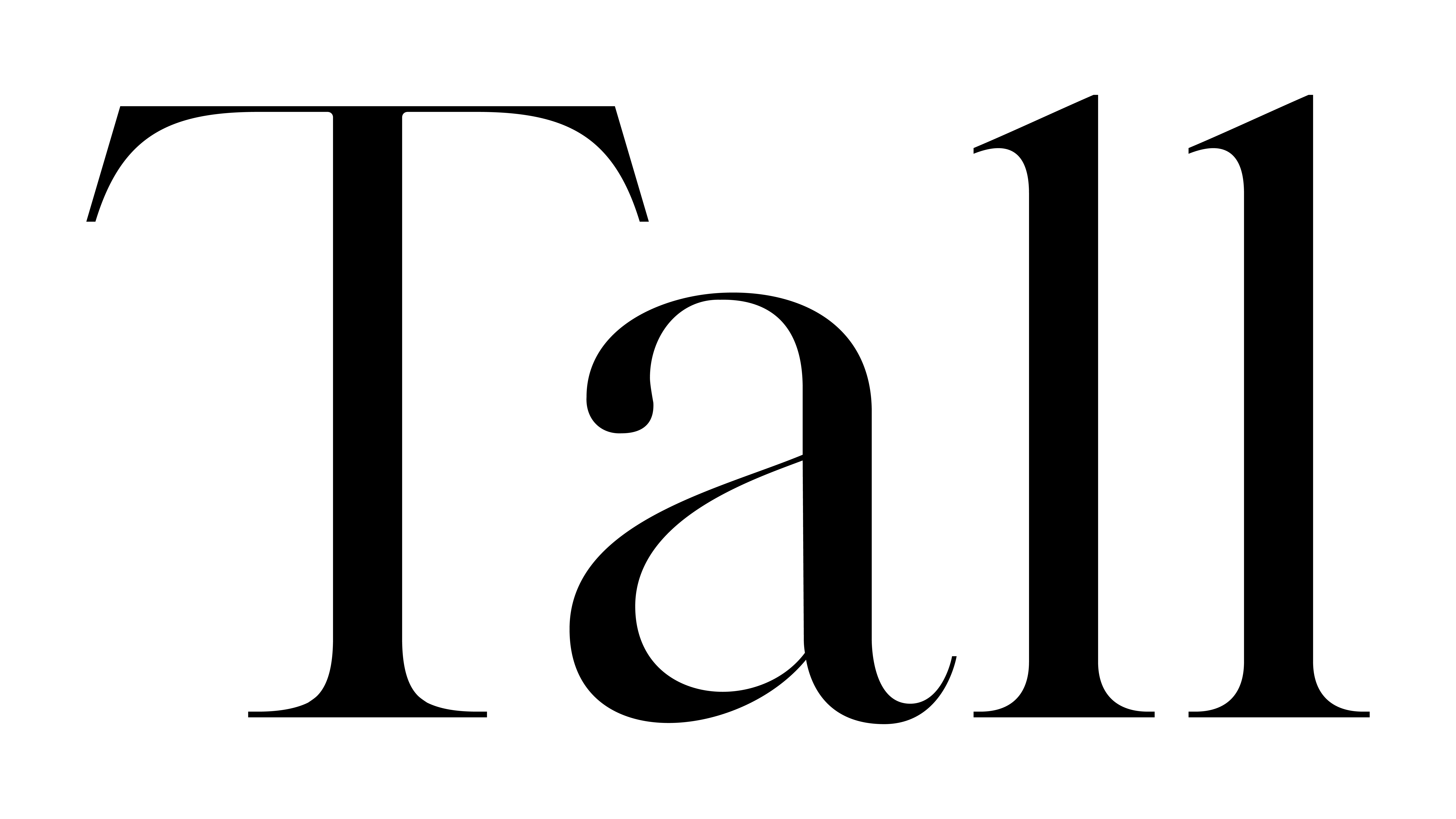
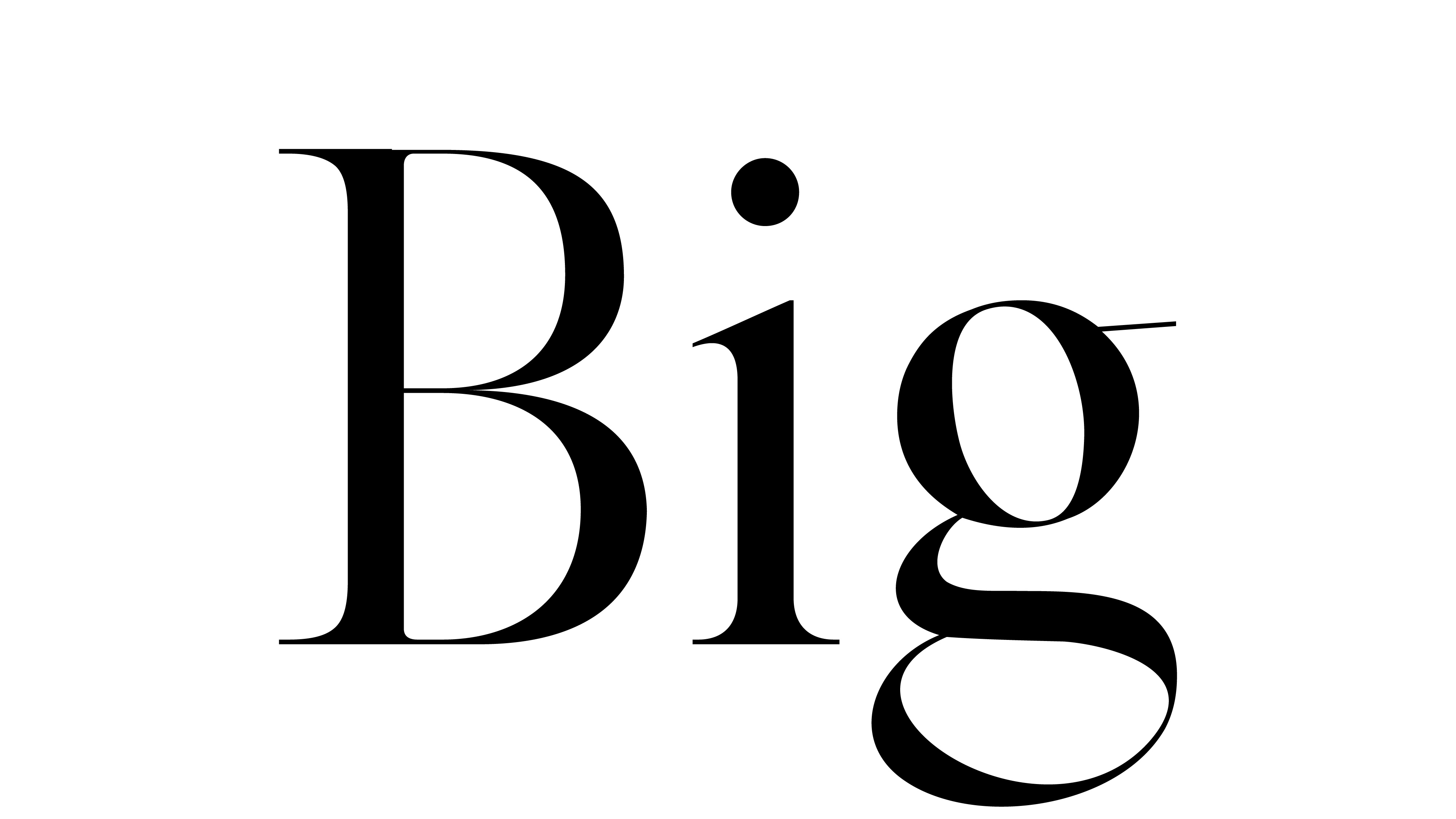
Times Display, inspired by Times Roman, offers a high-contrast experience for one of the most iconic classic typefaces. Featuring more dramatic stroke widths, narrower caps, and sharper serifs, Times Display displays elegance at large font sizes while remaining unmistakably Times.
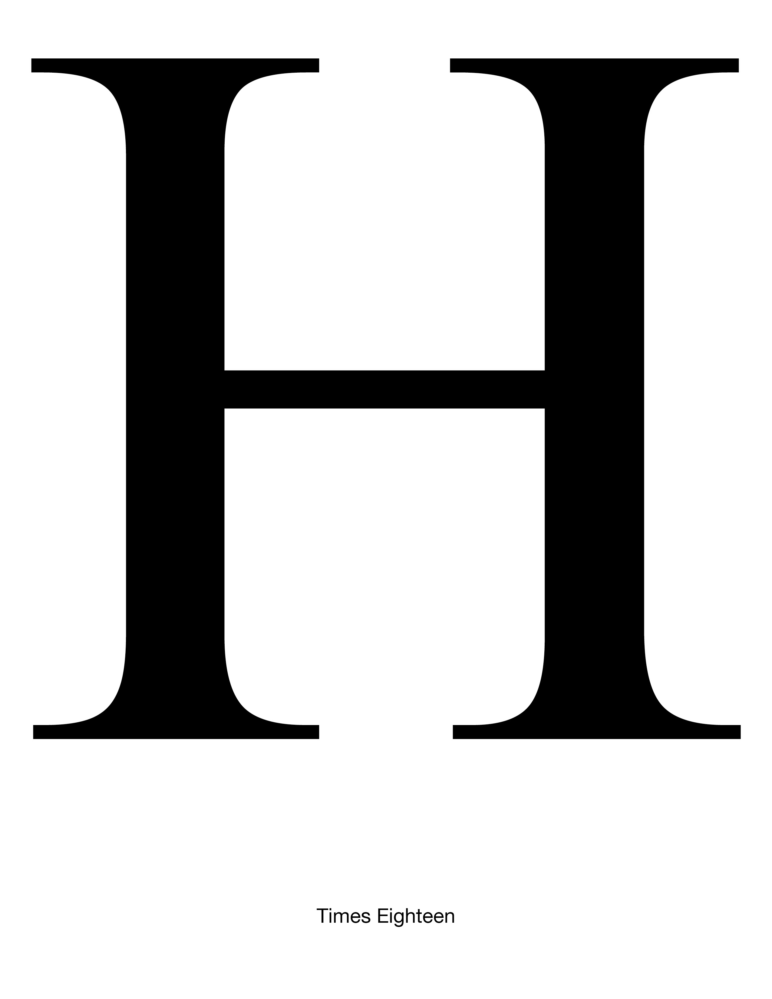
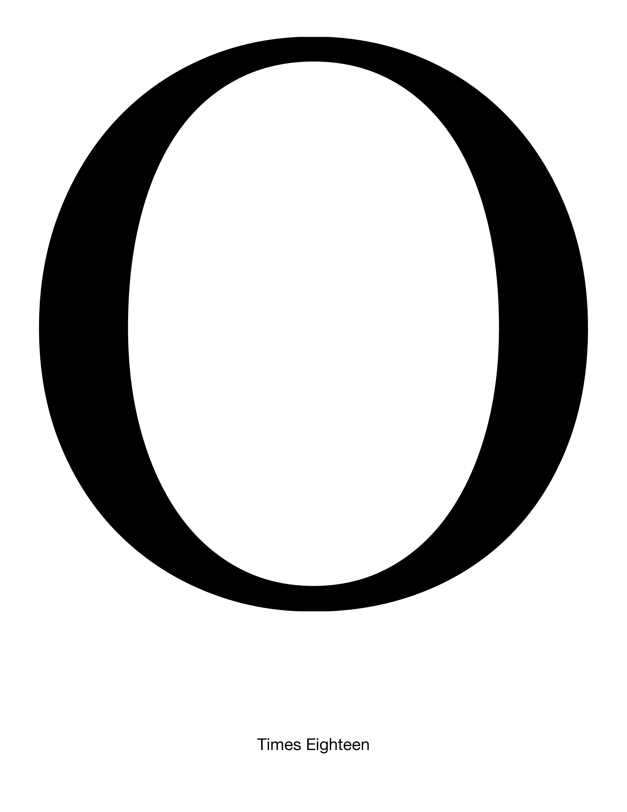
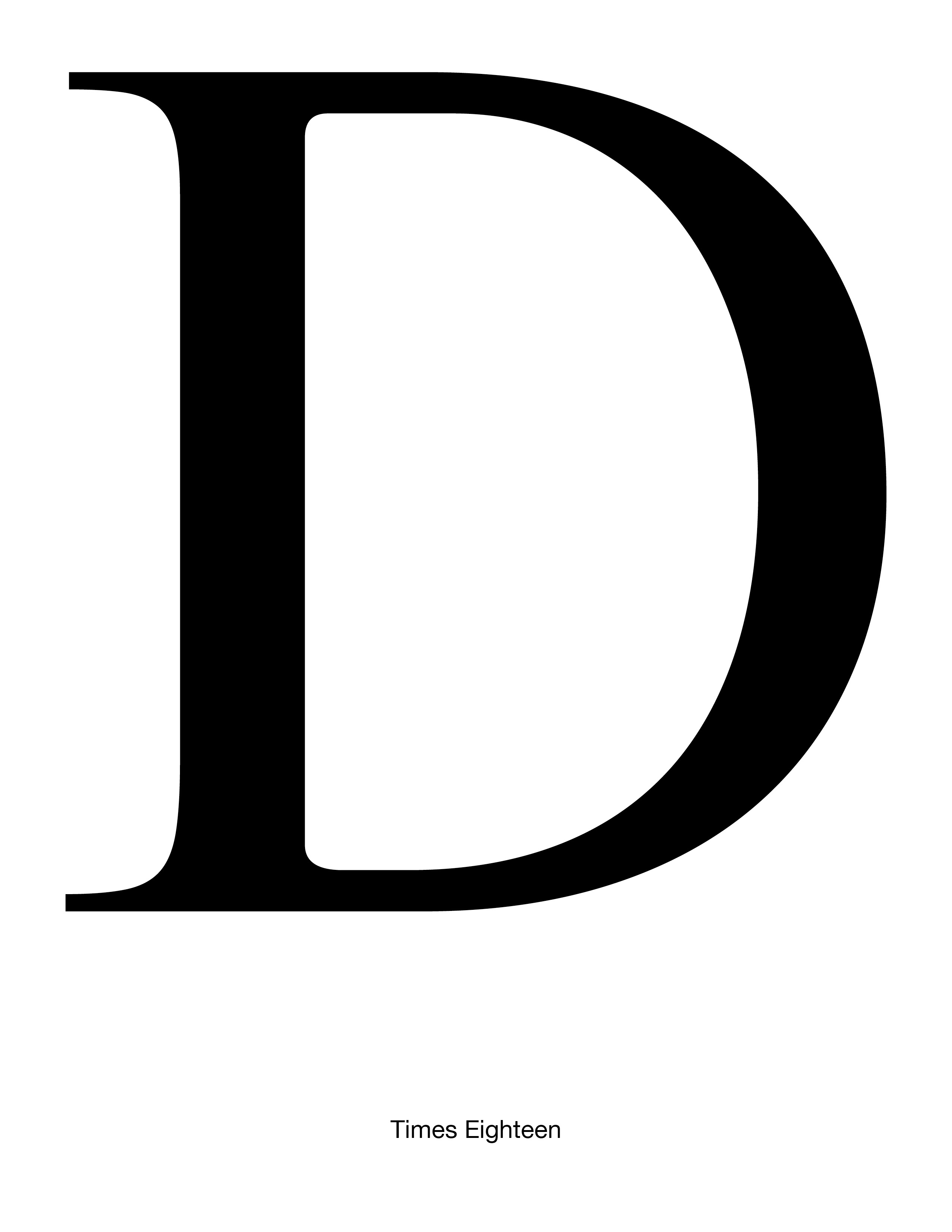
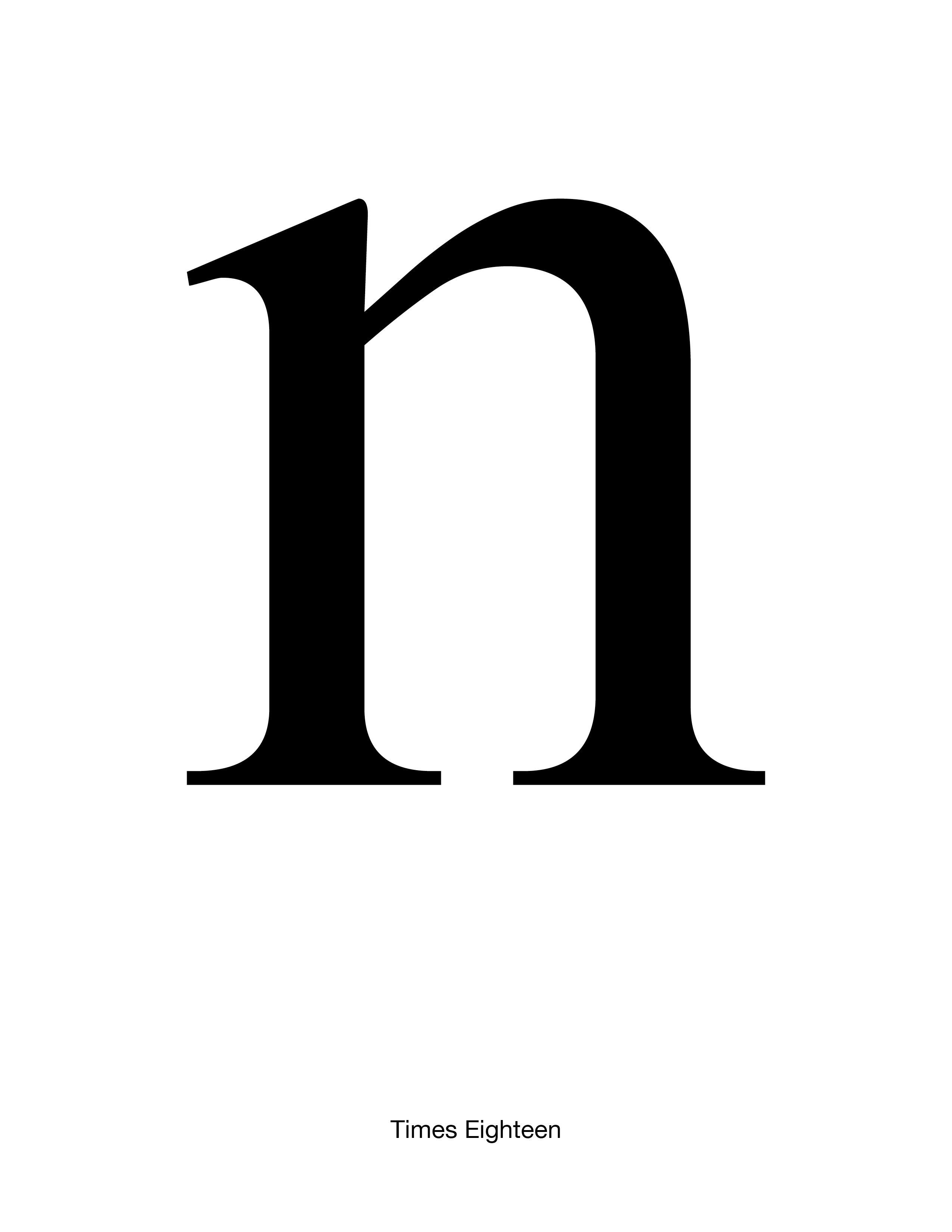
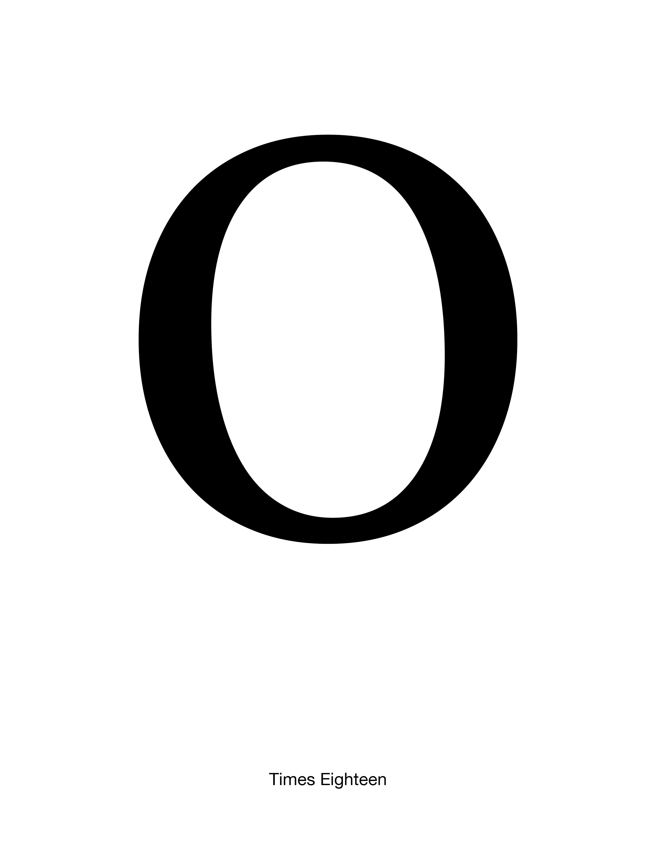
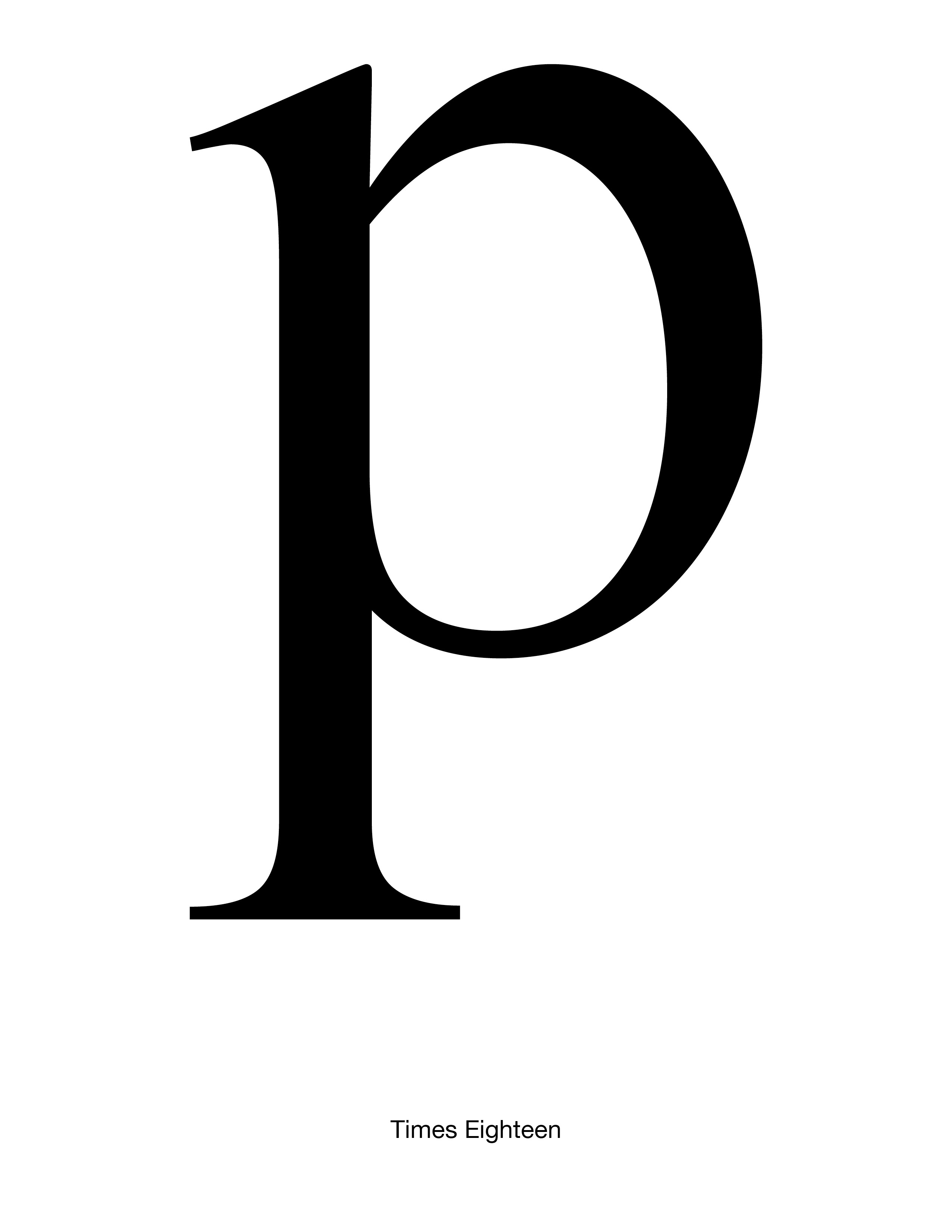
I felt inspired to create this typeface because I think Times Roman loses some of its signature sharpness at large font sizes. Although Times Ten and Times Eighteen attempt to resolve this issue, I still felt that these typefaces felt too blunt and blocky at display sizes. Creating Times Display offered not only an opportunity to learn the fundamentals of typeface design, but also a chance to obtain a version of Times that remains sharp and sleek in headlines.

These student typeface designs created at Yale School of Art are noncommercial academic projects, commonly revivals or reinterpretations of historical typefaces. Read more about these typeface design courses at Yale School of Art.
© 2020–2026 Yale School of Art. All rights reserved.